IELTS Task 1 Bar Chart Report – Data on Telephone Calls with Two Past Dates
This task on face value looks to be quite complicated and this could easily confuse an IELTS candidate.
Once I started looking at the question in more detail, it appeared that the task is more complex and there is a clear strategy to answering this question as well as specific requirements for a high-scoring report.
I am confident this approach is the best method for the type of information and the time allowed to answer the question.
There might be another method, but I believe this to be a high-scoring report.
Preparing to Write the IELTS Report
The first thing I did was to read the question slowly and carefully.
This gave me all the information that I needed in relation to the task requirements.
I noted that the topic was oil consumption and the categories were divided into consumers rather than countries or continents.
The dates are also mentioned in the question and it was clear that the dates range from 2009 to 2030.
This has a clear consequence as to the requirements of the task and the choice of grammar I would need to use depending on the figures and features in the graph.
First of all, I noted down the consumers which were the USA, China, the Middle East, and Western Europe and Japan combined which I found unusual.
I also noted the measurements which ranged from zero to 12 and noted that there is no unit of measurement, just simply a number.
I then checked the date range which was 2009 to 2030.
I decided that because of changes in tense and the clear categories, it would make sense to report each individual consumer on its own and in one paragraph.
This would help structure my writing and show progression which would improve my IELTS band score.
Then I double checked the key with the representation on the graph and started to consider my overview.
An overview was not generally clear and so I would need to make more of a passing or generalised comment which was; there was a predicted decline in all of the countries, bar one.
Another noticeable feature for the overview was that the USA, as a consumer, consumes far more oil than the other three categories of consumer.
Then I noted that currently we are in 2022 and I drew a line which represented this date on the paper.
This would mean that I could report consumption in the past using the past simple, projected figures using a future tense and if needed, I could use the present tense to refer to now.
Once I had drawn the line however, there did not seem to be any reason to use the present tense as there were no notable features in or around 2022.
It was at this point that I noticed a contrast between the USA and Western European and Japan. The contrast was that in the lead up to 2014, while the USA increased, Western Europe and Japan were already in decline.
It was at this point, 2015, where a decline started to take place for the USA.
Therefore I changed my tack or strategy and decided to report these two figures (USA/ Western Europe and Japan) within one paragraph making sure each change was reported.
I also noticed that consumption generally rose in China and the Middle East.
In fact, it’s predicted that by 2025 China’s figures will peak before they then decline. In contrast, consumption by the Middle East will continue to rise but at a more gradual pace.
This led me to the conclusion that these figures could be reported in a similar paragraph together.
The next stage was to construct some sentences using the past tense which would refer up to 2022 and then to consider future tenses and even the future present perfect to describe projected figures as in the example ‘will have fallen to just over 3.5’ and ‘there has been a steady decline since 2009’.
I felt that the image was quite simple but this graph’s main concern was to consider my ability to use tense for a number of different situations.
The biggest challenge I faced was avoiding being repetitive. Therefore I kept the description to a minimum.
If there were small or minute changes within a category, I would probably skip reporting these, focusing only on the main figures.
In fact, I wrote directly on the paper at each and every significant change, the number and the year, for example, (in 2009 the figure for the USA was nine) and (in 2015 this was 10).
This made it much easier to consider the overall grammatical aspects of the language I needed to use.
I didn’t spend too much on the introduction and attempted to paraphrase most of the sentences by changing the word order and the position of the dates.
Then I focused on providing a concrete and clear overview that mentions the two features I had already decided upon.
Finally, I moved on to the mechanical process of writing and reporting the key details, paying attention to the tense before moving on to the last paragraph.
Because of the complex nature of the writing, I allowed seven minutes at the end to check for spellings, but also to check for punctuation and grammatical sense and grammatical agreement. 🙂
Multiple information in a TASK 1 Question
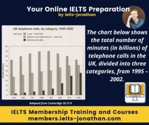
The chart below shows the total number of minutes ( in billions) of telephone calls in the UK, divided into three categories, from 1995 – 2002.
Summarise the information by selecting and reporting the main features and making comparisons where relevant
My IELTS report writing sample.
The bar chart shows the time spent by UK residents on different types of telephone calls between 1995 and 2002.
Local calls to a fixed telephone line were the highest throughout the period, rising from 72 billion minutes in 1995 to just under 90 billion in 1999. After this peak over the following years the number of minutes fell back to the 1995 figures by 2002. In contrast, national and international fixed line calls grew steadily from 38 billion to 61 billion throughout the period although this growth slowed over the last two years. There was a dramatic increase in calls made from mobile phones. The number of minutes used rose from 2 billion to 46 billion minutes. This rise was particularly noticeable between 1999 and 2002, during which time the use of mobile phones tripled.
In conclusion, although fixed line calls were still the most popular way to make a phone call in 2002, its use had decreased significantly and the gap between the three categories had narrowed in the last four years of the period so it is clear that mobile phones were becoming the preferred choice for voice calls.
Word count 192
Adapted from General IELTS Tasks online
I’m Jonathan, an online-IELTS preparation specialist.
I help IELTS students achieve the IELTS score they need with courses, training, feedback and advice.
I have taught IELTS and University English in more than a dozen universities and schools around the world.
I’m a parent, traveller and passionate about language teaching and helping students achieve their dreams.
Whilst living in Austria or working in Asia, I run IELTS courses to help students get to where they want to be.
If you are serious about IELTS, connect with me to see how I can help you.


