• Skip to primary navigation
  • Skip to main content
  • Skip to primary sidebar

IELTS Training with Jonathan

Helping Busy People Succeed in IELTS.

Facilitating student success in the IELTS Exam.

  • New!
  • About
  • Courses
  • Essay Questions
    • Task 1 IELTS
    • Task 2 IELTS
    • General Task 1
  • E Books PDF
    • IELTS PDF’s
  • IELTS ESSAY FEEDBACK CORRECTION
    • 10 IELTS Essay Corrections and Development Feedback
    • 2 Pre-test IELTS Essay Corrections and Feedback

IELTS Writing

How to write a strong Introduction for IELTS Task 1

By ielts-jonathan.com on 1 June 2022 1

ielts introduction

Writing an introduction for IELTS Task 1

How Paraphrase Verbs Nouns IELTS Task 1 Task 2

The introduction is the first section that the examiner sees when your writing is marked.

It is important to create a good impression in terms of language and purpose.

There are often two simple points to make when writing an IELTS Task 1 introduction; namely,

what is the point of the information and what is the numerical information. 

So, an introduction should explain what the chart/graph or map shows, for example, the type of graph, the unit of measurement, a summary of the information and the categories, the place and the time.

To do this, there is a formula you can generally follow.

What to write in an Introduction

The graph type & shows/compares & unit of measurement & what & categories & place & time

For example, let’s look at the attached visual

Looking at the graph, we can observe that

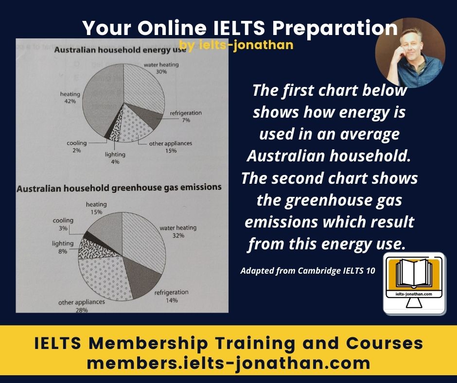
The graph type = The two pie charts

shows/compares = compare

unit of measurement and subject = how energy is used – emissions from energy use

categories = of six categories– –

place = in Australia

time = no time date is given

The two pie charts compare how energy is used and the emissions from energy use over six categories in Australia

IELTS LINE GRAPHS INTRODUCTION TASK 1

Introductions For Single images

If your question is a single visual, the most important thing to do in your introduction is to state what it shows and pay attention to the subject and verb agreement.

You can obtain this information from the legend on the pictorial and from the question itself.

Here is an example question from IELTS.

The graph presents the energy consumption by a typical British household.

An example sentence that you could rewrite and use for your introduction could be:

The chart shows how energy is used in an average household in the United Kingdom…

Introductions for more than one image 

When the question features two graphs, for example, then you should write one sentence but write about each pictorial separately and state what each shows.

Pay attention again to the subject and verb agreement

As before, this is obtainable from the legend on the pictorial and from the question itself.

Here is an example question from IELTS.

The first graph presents the energy consumption by a typical British household. The second graph presents how much consumption is generated for renewable energy.

This is the example sentence rewritten:

The first bar chart illustrates how energy is used in an average United Kingdom household…, and the second chart shows how much of that energy comes from renewable energy sources….

or

The charts illustrates how energy is used in an average United Kingdom household and how much of that energy comes from renewable energy sources….

Use synonyms introductions IELTS task 1

How to write the introduction

As you can see, writing an introduction sentence for Task 1 can be relatively simple.

You will need to practice this to get better so I have provided the steps for you to follow.

Remember, you will also need to practice writing for different topics and get used to reading the questions carefully even if you follow my advice.

For a Single Graph

How Write Task 1 IELTS introduction

Use this rule:

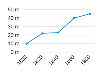
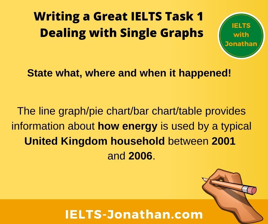
The line graph/pie chart/bar chart/table provides information about … (state what happened, where it happened and or when it happened)

Step One – State what happened

The line graph/pie chart/bar chart/table provides information about how energy is used

Step Two – State where it happened

The line graph/pie chart/bar chart/table provides information about how energy is used by a typical British household

Step Three – State when it happened

The line graph/pie chart/bar chart/table provides information about how energy is used by a typical United Kingdom household between 2001 and 2006.

For Double Graphs

How write multiple chart introduction

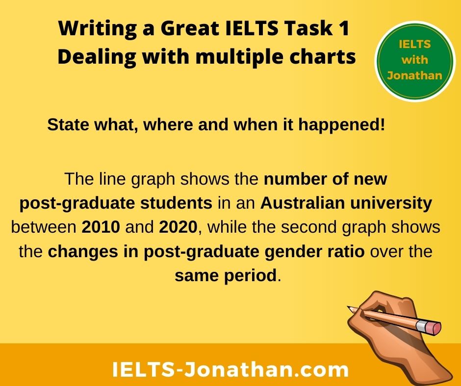
Use the same rules, but apply these to both graphs.

The line graph/bar chart/pie chart/table provides information about …(state what happened ,where it happened and or when it happened) while the pie chart/table/bar chart/line graph indicates (state what happened ,where it happened and or when it happened)

The line graph shows the number of new post-graduate students in an Australian university between 2010 and 2020 while the second graph shows the changes in post-graduate gender ratio over the same period.

IELTS Paraphrasing an Introduction

Never just copy the title and use this for you introduction. 

If you do this, the examiner will just ignore the introduction.

Use the information IELTS gives you, but put it into your own words.

One way you can paraphrase is by changing verbs into nouns and nouns into verbs.

Although these examples are from the body of an essay, they illustrate the principles of paraphrasing.

The UK invested more money than other countries in the EU.

The investment by the UK was more than other countries in the EU.

India consumes more energy for renewable solar than other countries.

The consumption of renewable solar energy is highest in India than in other countries.

and this is from an introduction

The tables show the total investment into to renewable energies of five countries between 2010 and 2020.

The information shows how much 5 countries invested in green energy production over one decade.

Turn Active sentence into Passive sentences

Active passive IELTS Introduction paraphrase

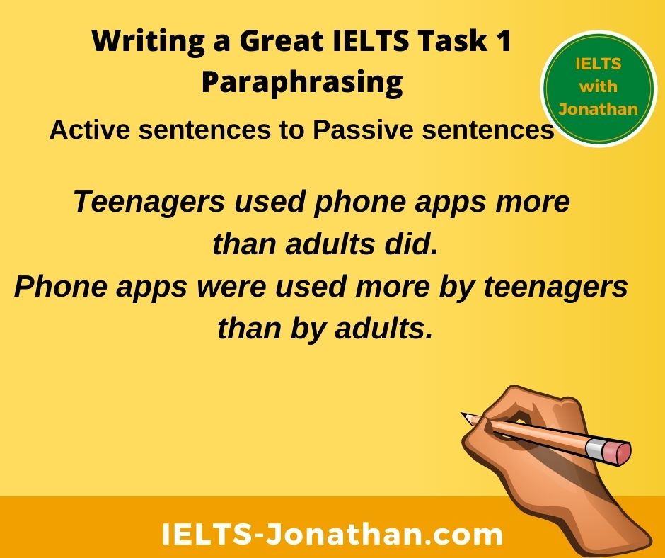
Teenagers used phone apps more than adults did.

Phone apps were used more by teenagers than by adults.

Use Synonyms and Antonyms

How use Synonyms IELTS Paraphrase Task 1

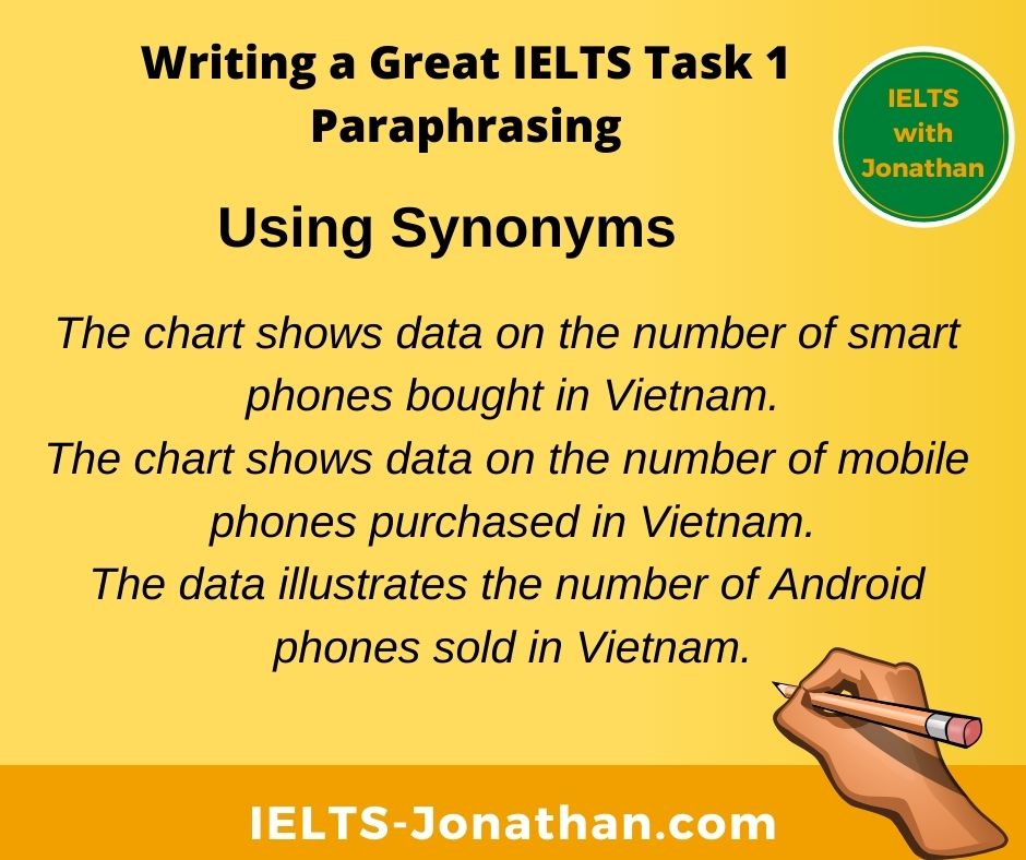
The chart shows data on the number of smart phones bought in Vietnam.

The chart shows data on the number of mobile phones purchased in Vietnam.

The data illustrates the number of Android phones sold in Vietnam.

Another way to paraphrase is to use phrases like ‘how much’, ‘how many’ and ‘how’.

Look at these examples and compare.  

  • The pie chart shows the amount of money students’ spent on living expenses. The amount of money / how much money

The pie chart shows how much money was spent on living expenses by students

  • The line graph shows the number of people who emigrated to New Zealand during the last year. The number of people / how many people

The line graph shows how many people emigrated to New Zealand last year.

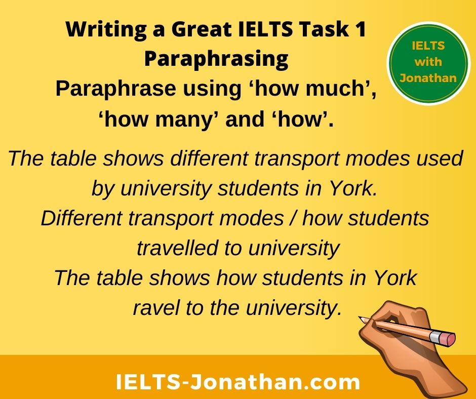
  • The table shows different transport modes used by university students in York. Different transport modes / how students travelled to university

The table shows how students in York travel to the university.

How IELTS Paraphrase Task 1 Examples

Reporting verbs in IELTS

It is important to have a good range of reporting verbs so you are able to paraphrase the verbs used in the question.

This makes the examiner aware you simply have not copied the topic question.

How Paraphrase Reporting Verbs IELTS Task 1

Look at the examples below and the notice the change of verb has been paraphrased.

Question:

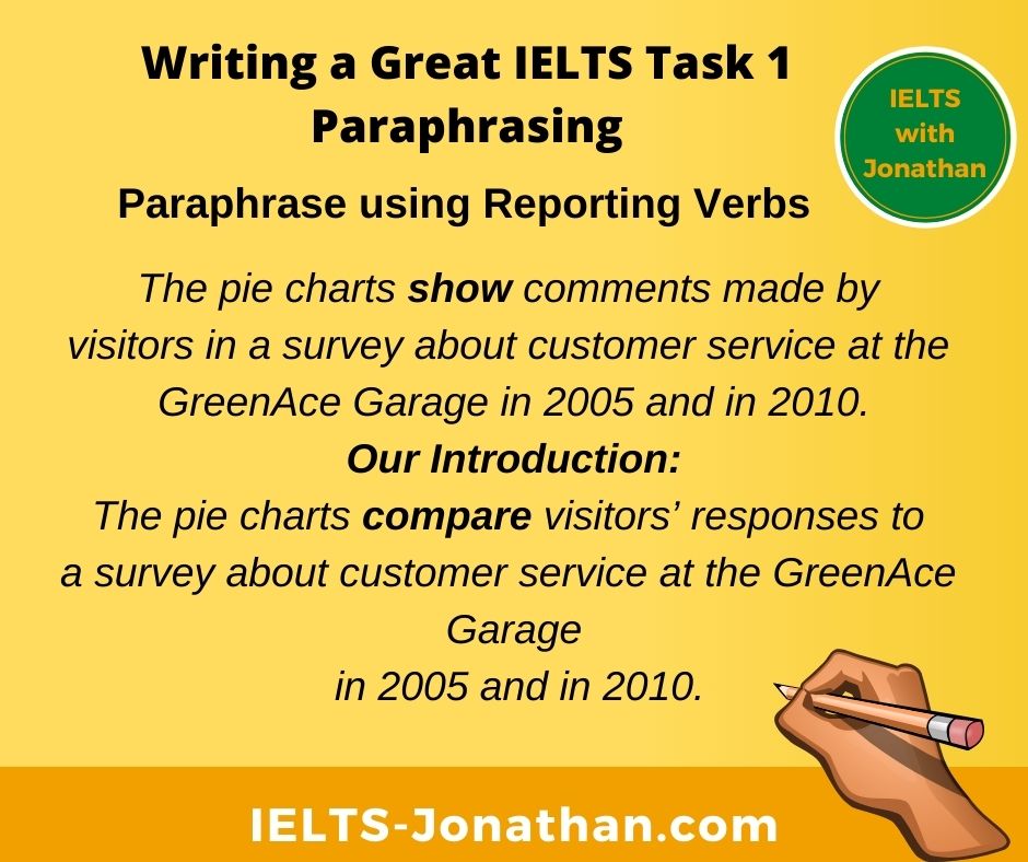
The pie charts show comments made by visitors in a survey about customer service at the GreenAce Garage in 2005 and in 2010.

Our Introduction:

The pie charts compare visitors’ responses to a survey about customer service at the GreenAce Garage in 2005 and in 2010.


The line graph below shows changes in the amount and type of fast food consumed by British teenagers from 2005 to 2015.

Our introduction: 

The chart illustrates changes in the amount and type of fast food consumption by British teenagers between 2005 to 2015.


The graph shows the use of high-speed broadband internet in Korea from 1980 to 2010.

Our Introduction:

The graph compares the consumption of high-speed broadband internet in Korea in the period 1980 to 2010.


The graph shows how the internet is distributed between users of different income levels in China between 2003 to 2006.

Our Introduction:

The bar graph provides information about the distribution of internet users according to income level in China over three consecutive years.


The diagram below shows the average hours of unpaid work per week done by women.

Our Introduction: 

The table illustrates how much unpaid work is done by women on average each week.

Set Phrases to Paraphrase

How IELTS Paraphrase Task 1 Examples Phrases

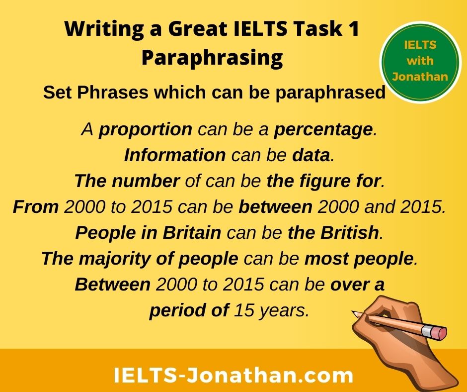
Finally, just look at how simply you can paraphrase by replacing keywords.

You can see how using synonyms helps you paraphrase the introduction.

I recommend that you use a vocabulary journal to note any new words you learn and try paraphrasing when you are practicing IELTS WRITING TASK 1.

A graph can be a line chart, a bar chart or chart.

A chart can be line graph, a bar graph or a bar graph.

A diagram can be a figure and a figure can be a diagram.

Shows can be illustrates if there is a comparison.

A proportion can be a percentage.

Information can be data.

The number of can be the figure for.

The proportion of can be the figure for.

People in Britain can be the British.

The majority of people can be most people.

From 2000 to 2015 can be between 2000 and 2015.

Between 2000 to 2015 can be over a period of 15 years.

How to deliver can be the process of delivery.

In three countries can be in the UK, Germany and France.

Test yourself 

ielts pencil

How many synonyms can you think of for these three words? 

Don’t use a dictionary and remember a synonym is not the exact meaning, but a similar one.

Buy

Synonyms (informal):

Synonyms (formal):

Global warming

Synonyms:

Travel

Synonyms:

Some suggestions;

Buy

Synonyms (informal): To get, To grab st quickly, to get a good deal, to get a good bargain, to pick st up.

Synonyms (formal): Purchase, acquire, consume (consume and consumption are useful to describe larger economic trends for Writing Task 1)

Global warming

Synonyms: Environmental issues, harmful pollution, greenhouse effect, the warming of the planet.

Travel

Synonyms: Explore, go on an adventure, take an adventure, go on an excursion, get away, take a break, take along break, take a short break.

How was this post? I hope you found it useful.

Comment below if you have any questions.

Remember.

In Task 1, candidates are asked to describe some visual information a graph, table, chart or diagram. You need to write 150 words in about 20 minutes and you must not copy the question for your introduction. 

Share
Pin66
Share
Tweet
66 Shares

I’m Jonathan

I’ve taught IELTS and University English in more than a dozen universities and schools around the world.

I’m a parent, traveller and passionate about language teaching and helping students achieve their dreams.

Whilst living in Austria or working in Asia, I run IELTS courses to help students get to where they want to be.

If you are serious about IELTS, connect with me to see how I can help you.

Sign up to the Newsletter

Like this:

Like Loading...

How to describe an IELTS Task 1 Graph question

By ielts-jonathan.com on 28 May 2022 0

IELTS Past Projected Figures Task 1 Oil consumption Four Countriesl

IELTS Task 1 Graph Report – Past and Predicted figures or Projections 

This task on face value looks to be quite simple but apparent simplicity could easily confuse an IELTS candidate. 

Once I started looking at the question in more detail, it appeared that the task is more complex and there is a clear strategy to answering this question as well as specific requirements for a high-scoring report.

I am confident this approach is the best method for the type of information and the time allowed to answer the question.

There might be another method, but I believe this to be a high-scoring report.

IELTS Past Projected Figures Task 1 Oil consumption Four Countriesl

Preparing to Write the IELTS Report

The first thing I did was to read the question slowly and carefully.

This gave me all the information that I needed in relation to the task requirements. 

I noted that the topic was oil consumption and the categories were divided into consumers rather than countries or continents. 

The dates are also mentioned in the question and it was clear that the dates range from 2009 to 2030. 

This has a clear consequence as to the requirements of the task and the choice of grammar I would need to use depending on the figures and features in the graph.

First of all, I noted down the consumers which were the USA, China, the Middle East, and Western Europe and Japan combined which I found unusual. 

I also noted the measurements which ranged from zero to 12 and noted that there is no unit of measurement, just simply a number.

I then checked the date range which was 2009 to 2030.

I decided that because of changes in tense and the clear categories, it would make sense to report each individual consumer on its own and in one paragraph. 

This would help structure my writing and show progression which would improve my IELTS band score.

Then I double checked the key with the representation on the graph and started to consider my overview.

An overview was not generally clear and so I would need to make more of a passing or generalised comment which was; there was a predicted decline in all of the countries, bar one.

Another noticeable feature for the overview was that the USA, as a consumer, consumes far more oil than the other three categories of consumer.

Then I noted that currently we are in 2022 and I drew a line which represented this date on the paper. 

This would mean that I could report consumption in the past using the past simple, projected figures using a future tense and if needed, I could use the present tense to refer to now.

Once I had drawn the line however, there did not seem to be any reason to use the present tense as there were no notable features in or around 2022.

It was at this point that I noticed a contrast between the USA and Western European and Japan. The contrast was that in the lead up to 2014, while the USA increased, Western Europe and Japan were already in decline.

It was at this point, 2015, where a decline started to take place for the USA. 

Therefore I changed my tack or strategy and decided to report these two figures (USA/ Western Europe and Japan) within one paragraph making sure each change was reported. 

I also noticed that consumption generally rose in China and the Middle East.

In fact, it’s predicted that by 2025 China’s figures will peak before they then decline. In contrast, consumption by the Middle East will continue to rise but at a more gradual pace. 

This led me to the conclusion that these figures could be reported in a similar paragraph together. 

The next stage was to construct some sentences using the past tense which would refer up to 2022 and then to consider future tenses and even the future present perfect to describe projected figures as in the example ‘will have fallen to just over 3.5’ and ‘there has been a steady decline since 2009’. 

I felt that the image was quite simple but this graph’s main concern was to consider my ability to use tense for a number of different situations.

The biggest challenge I faced was avoiding being repetitive. Therefore I kept the description to a minimum. 

If there were small or minute changes within a category, I would probably skip reporting these, focusing only on the main figures.

In fact, I wrote directly on the paper at each and every significant change, the number and the year, for example, (in 2009 the figure for the USA was nine) and (in 2015 this was 10).

This made it much easier to consider the overall grammatical aspects of the language I needed to use. 

I didn’t spend too much on the introduction and attempted to paraphrase most of the sentences by changing the word order and the position of the dates. 

Then I focused on providing a concrete and clear overview that mentions the two features I had already decided upon.

Finally, I moved on to the mechanical process of writing and reporting the key details, paying attention to the tense before moving on to the last paragraph. 

Because of the complex nature of the writing, I allowed seven minutes at the end to check for spellings, but also to check for punctuation and grammatical sense and grammatical agreement. 🙂

Two Tables in a TASK 1 Question

The graph below shows information about the total oil consumption of four major consumers from 2009 to 2030.

IELTS Past Projected Figures Task 1 Oil consumption Four Countriesl


Summarise the information by selecting and reporting the main features and making comparisons where relevant 

My IELTS report writing sample. 

The line graph gives information about the consumption of oil in four different regions from 2009 until the present day and the predicted figures until 2030. 

Overall, the USA has been the biggest consumer of oil by far and while this use is predicted to decline, it will remain the largest consumer until 2030. Another noticeable trend is that general oil consumption is predicted to decrease apart from in one country.

In 2009, oil consumption in the USA was around 9 million barrels per day. This figure rose to around 10 million barrels per day by 2015, before beginning to fall. By 2025, consumption is predicted to have fallen to around 8 million barrels per day and is likely to be just under this number by 2030. In contrast, oil consumption in Western Europe and Japan was around 4 million barrels per day in 2009 and has been in a steady decline since then. Figures are predicted to reach a low of 2 million barrels by 2030.

Oil consumption in China and the Middle East was around 2 million barrels per day in 2009. While China’s consumption is estimated to peak at 4 million barrels in 2025, by 2030 the figures for China will have fallen to just over 3.5. In comparison, the figures for the Middle East increase steadily over the whole period from 2 million barrels to 3 million barrels in 2030. 

Word Count 235  

Adapted from General IELTS Tasks online 

I’m Jonathan, an online-IELTS preparation specialist.

I help IELTS students achieve the IELTS score they need with courses, training, feedback and advice.

I have taught IELTS and University English in more than a dozen universities and schools around the world.

I’m a parent, traveller and passionate about language teaching and helping students achieve their dreams.

Whilst living in Austria or working in Asia, I run IELTS courses to help students get to where they want to be.

If you are serious about IELTS, connect with me to see how I can help you.

Sign up to the Newsletter


Share this:

  • Click to share on Twitter (Opens in new window)
  • Click to share on Facebook (Opens in new window)
  • Click to share on Pinterest (Opens in new window)
  • Click to share on WhatsApp (Opens in new window)
  • Click to share on Telegram (Opens in new window)
  • Click to share on Tumblr (Opens in new window)
  • Click to share on LinkedIn (Opens in new window)
  • Click to print (Opens in new window)

Like this:

Like Loading...

How to describe Changes and Trends in IELTS Writing Task 1

By ielts-jonathan.com on 21 May 2022 3

IELTS DESCRIBING CHANGES

Describing Change and Trends in IELTS

The ability to describe changes and trends is an important language skill in the IELTS test but it can be challenging. 

You will often get a graph or bar chart that appears complex. 

There may be many visible changes or the exact information may be difficult to interpret. 

It may be difficult to see exactly what overview could be reported. 

IELTS GRAPHS CHANGES TRENDS


Challenges with this language 

The biggest issue I see in these types of tasks is students selecting and reporting minor details. 🙁

When this happens, it can lead to inaccurate and unnecessary language.

Inaccurate language often happens when trying to explain something that the examiner really isn’t interested in.

Unnecessary language happens when trying to over-explain something that could be written much simply.

Follow a Plan and Stick to it

Remember you need only describe the significant features, so don’t overcomplicate the task!

A good plan to follow is to include an introduction, an overview and select the key features of the chart and avoid reporting the minor details. 

Language to show changes and trends

It is important to display enough language to the examiner.

Once you have identified the key features, then you can narrow your language and use it appropriately as and when you need it.

So find a graph, and select the important or significant points.

Then select and use the language examples below to describe and produce a clear and simple text that displays enough, high-level examples of language to satisfy the IELTS examiner. 🙂

Verb Phrases to show an Increase 

IELTS JONATHAN ARROW

To show a general upward trend, use the verb phrases in bold.

To show that there was a general change, use;

  • Mobile phone sales rose to 49.000 at the end of the period.

To show that there was a change in the amount, use;

  • Mobile phone sales rose by 5% in 1998. (for example: If the percentage was 55% in 1998 and in 1997 it was 50%)

Other collocations you can use for variation are increased to/by and rocketed to/by.

  • The number of children attending the college increased to 865 in 2020.
  • The number of subjects chosen by female students increased by three in 2022.

Note: I personally don’t like the term ‘rocketed to/by’– meaning to increase very quickly.

I have never read this in an academic text, and so it apears to be informal to me, but this is my personal viewpoint.

Noun phrases to show an Increase

IELTS JONATHAN ARROW

Instead of a verb you can focus on the noun in a sentence.

This is a good paraphrasing skill.

Look at the structure of the noun phrase in these examples and note the preposition used.

  • There was + a rise/rise of/an increase of/to.
  • See + a rise/rise of/an increase of/to.

Examples

  • There was a rise of 5% in mobile phone sales in 1998.
  • There was a rise in the mobile sales by 5%.
  • There was an increase in the number of mobile phones sold by 5%.
  • Mobile phones saw an increase in sales over the ten-year period.

To show a general downward trend, use these verb phrases.

Verb phrases to show a decline 

ielts decrease

  • Laptop computer sales fell to 5.000 in 1998.
  • Laptop computer sales fell by 20% in 1998.
  • Laptop computer sales decreased by 20%.
  • Laptop computer sales decreased to 10.000.
  • Laptop computer sales slowed to 10.000.
  • Laptop computer sales declined by 20%.

Noun phrases to show a decline 

ielts decrease

Again, instead of a verb you can pararphrase and focus on the noun in a sentence.  

Here is the structure of a noun phrase.

There +

  • was + a fall
  • was + a decline
  • was + a decrease
  • was + a decrease of
  • was + a decrease in 
  • see + a fall
  • see + a fall in
  • see + a decrease of
  • see + a decrease in
  • see + decline in
  • see + decline of

Examples

  • There was a fall in soft drink sales in 1998.
  • There was a fall of 20% in the soft drink sales in 1998.
  • Soft drink sales saw a fall of 20% in sales.
  • Soft drink sales saw a decrease of 20% in sales.

Tip: A good way to remember and practice these is to write your own examples in your journal and refer to this article when you do an IELTS Practice task.

IELTS GRAPHS CHANGES TRENDS

Static Information over a period or No changes

Sometimes there are no changes or the situtaion remains stable for a long period.

Remember you need only describe the significant features in an IELTS report and you lose marks when you try to describe minor detail.

However, a significant feature or an overview in IELTS TASK 1 might be no change.

You can use these phrases to talk about stability.

Verb phrases to show stability

ielts stability

  • Desktop computer sales did not change over 3 years.
  • The number of desktop computers sold did not change over a period of 3 years.
  • Desktop computer sales remained stable from 2000 to 2003.
  • Desktop computer sales remained stable at around 66.000 per month over 3 years.

Noun phrases to show stability  

ielts stability

  • There was no change in desktop computer sales over 3 years.
  • There was a period of stability in desktop computer sales of around 66.000 per month.

Sometimes the simpler expressions are the best so use this article when you do a practice task and note your examples.

The more you practice the easier the task will be. 🙂 

Showing the position in a year

When you are showing the position of the “something” in any year or period, you could use one of the following phrases.

Verb phrases to show a point or a position 

IELTS JONATHAN ARROW

Something +

  • was +at
  • stood +at

Example

  • Desktop computer sales stood at 16.000 in 1992.
  • Desktop computer sales were at 16.0000 in 1992.

Noun phrases to show a point or position 

IELTS JONATHAN ARROW

Something  +

  • reach a high
  • reach a low

Example

  • Desktop computer sales reached a high of 160.000 in 1998.
  • Desktop computer sales reached a low of 10.000 in 1995.

Finally, here are some phrases to use to show that there was significant constant change or instability.

Verb phrases to show a constant change

IELTS FLUCTUATIONS

  • Desktop computer sales fluctuated around 60.000 over two years.

Noun phrases to show a constant change

IELTS FLUCTUATIONS

  • There was a fluctuation in desktop computer sales of around 60.000.

There are more expressions you could choose from, however, some of these may be less commonly used and so may stand out in your writing. 🙁

It is probably better to select a few of the common and practice these in your IELTS writing preparation. 

Practice makes perfect and leads to better writing. 🙂

Practice Test Changes and Trends

Now you have studied ways of describing change and trends, have a go at this test of applying a suitable phrase to a chart and combining them with adverbs.

TIP, pay attention to the grammar to help you choose between noun and verb phrases.

Graph IELTS Jonathan

Complete the Task 1 example below using these words.

period, increase, sharp fall, slight increase, decrease gradually, fluctuation, change, reach a peak

The graph shows the _______ in numbers of students at Ox College over a ______ of one year.

Between January and March, there was a _______________ in student numbers. This was followed by a _______ in numbers over the next three months. In June, enrollments ____________ in numbers. After that, there was a _______ in numbers. Finally numbers   _________________ from August to December.

Overall,  there were ____________ in the numbers of students, but in can be seen the college’s busiest month was June.

Answer Key

The graph shows the changes in numbers of students at Ox College over a period of one year.

Between January and March, there was a slight increase in student numbers. This was followed by a dramatic increase in numbers over the next three months. In June, enrollments reached a peak in numbers. After that, there was a sharp fall in numbers. Finally numbers decreased gradually from August to December.

Overall,  there were fluctuations in the numbers of students, but it can be seen the college’s busiest month was June.

Share
Pin25
Share
Tweet
25 Shares

I’m Jonathan

I’ve taught IELTS and University English in more than a dozen universities and schools around the world.

I’m a parent, traveller and passionate about language teaching and helping students achieve their dreams.

Whilst living in Austria or working in Asia, I run IELTS courses to help students get to where they want to be.

If you are serious about IELTS, connect with me to see how I can help you.

Sign up to the Newsletter

Like this:

Like Loading...

How to describe Tables in an IELTS Task 1 question

By ielts-jonathan.com on 19 May 2022 0

IELTS Task 1 Table Report – Sales figures of two products in two periods

In this task, I found that the information is laid out in such a way that there could be two approaches to structuring a high-level IELTS report.

This is only the approach that I took to answering and writing this IELTS question from Cambridge English IELTS and you could write a different report.

Whether that report would score a 7 is debatable. 

I am confident this approach is the best method for the type of information and the time allowed to answer the question.

For example, I decided to include the additional or differing information in the final paragraph.

First of all, I read the question and established that there were two dates or periods. Then I noted that there were two categories, bananas and coffee.

I also noted the number of categories which was five, and, by chance, I noticed that they do not run in the same order, for example.…..

Was there a reason for this? 

As the products or crops were different, I decided that I would not compare coffee with bananas but focus on coffee in 1999 and 2004 and then do the same for the second category, bananas.

It would make sense for these to be in separate paragraphs.

This would make the structure logical and the writing progressive as I would be describing similar data in each paragraph.

Good structure and progression could also improve my IELTS band score. 

I made a mental note that all the dates were in the past, and there was no connection or reference to the present time.

This means the grammar would likely be straightforward and be limited to the Past Simple by only to referring to the two dates.

No need for Perfect or Past Perfect tenses today!

Then I spent some time looking at the figures and decided that while there might appear to be some similarities most of the figures are ranked.

Ranking the figures means that I could just focus on the large numbers, the medium sized numbers and the smallest. 

I also decided that I would limit the language to describing increases and decreases (because the figures relate to amounts).

Again, I decided that most of the figures should simply be reported, from the highest to the lowest.

After describing the figures in decending order, I would then decribe the figures that are different to the others, namely Swedish and Danish banana figures.

I did not spend too much time writing the introduction but I did point out that the figures were ranked.

My biggest concern was to make sure that the introduction was clear and to the point.

I reported in my overview that there were general increases (sales increases) but there were two exceptions to this, Sweden and Denmark.

Next, I described that data as I saw it and by rank and I did this for both paragraphs. 

I made sure that I reported all of the figures in both years and for both categories.

Only in the last paragraph did I say that there was a decrease in the sales of two categories.

In order to meet the word count requirements of the task, each body paragraph had a small introductory sentence at the beginning.

Reporting just the figures would not show progression and it would be obvious the writing would be below the 150 words.

The biggest challenge I faced was trying to avoid the phrase ‘millions of euros‘.

If you repeat a phrase or word too often, or use a phrase from the question a number of times, there is risk of repetition or it ‘standing out negatively’. 

I had to accept that measurements and the currency were important so I would need to craft my words to avoid any issues, although there may be some.

I did this by simply reporting ‘the numbers’, or mentioning figures as ‘euros‘, once it was established that the figures were all in ‘millions of euros‘, for example, ‘from 0.8 to 1 million Euros in Sweden‘, ‘1.5 to 20 million Euros‘, ‘from 1 to 5.5 million‘.

🙂

Two Tables in a TASK 1 Question

The tables below give information about sales of Fairtrade-labelled coffee and bananas in 1999 and 2004 in five European countries.   


Summarise the information by selecting and reporting the main features and making comparisons where relevant 

My IELTS report writing sample ‘in my own words’. 

The two tables contain the sales data from Fairtrade coffee and bananas in 1999 and 2004 in relation to five European nations and additionally ranks the highest figures recorded in 2004.  

It is clear that overall sales of coffee and bananas have increased across the five countries except for Sweden and Denmark where the sales of bananas decreased.  

By looking at Fairtrade coffee sales we can see that there were small increases in sales volume in Sweden Belgium and Denmark over the period. Sales increased from 0.8 to 1 million Euros in Sweden, 1 to 1.7 Euros in Belgium and there was a small increase from 1.8 to 2 Euros in Denmark. There was a larger increase in Switzerland where sales doubled from 3 to 6 Euros, however it was the UK that saw the most dramatic rise, increasing from just 1.5 to 20 million Euros.  

When looking at the sales of Fairtrade bananas, we can also see two notable increases. In this case, it is Switzerland that records the largest increases from 15 to 47 million while the UK recorded the second largest increase from 1 to 5.5 million. Belgium also saw a similar increase to the UK where its sales rose from 1 to 4 million. Finally, two countries saw a decrease in banana sales. Sales in Sweden dropped from 1.8 to 1 million and there was a larger decrease in Denmark where sales went from 2 to 0.9 million Euros.  

Word Count 243  

Adapted from Cambridge English IELTS 10, 2015  

I’m Jonathan, an online-IELTS preparation specialist.

I help IELTS students achieve the IELTS score they need with courses, training, feedback and advice.

I have taught IELTS and University English in more than a dozen universities and schools around the world.

I’m a parent, traveller and passionate about language teaching and helping students achieve their dreams.

Whilst living in Austria or working in Asia, I run IELTS courses to help students get to where they want to be.

If you are serious about IELTS, connect with me to see how I can help you.

Sign up to the Newsletter


Share this:

  • Click to share on Twitter (Opens in new window)
  • Click to share on Facebook (Opens in new window)
  • Click to share on Pinterest (Opens in new window)
  • Click to share on WhatsApp (Opens in new window)
  • Click to share on Telegram (Opens in new window)
  • Click to share on Tumblr (Opens in new window)
  • Click to share on LinkedIn (Opens in new window)
  • Click to print (Opens in new window)

Like this:

Like Loading...

How to answer two Pie Charts in an IELTS Task 1 question

By ielts-jonathan.com on 11 May 2022 0

Task 1 household consumption and emissions in Australian pie charts

The advice I am give here is only the approach that I took to answering and writing this IELTS question from Cambridge English IELTS.

By following the method I outline, you can develop your own strategy to answer IELTS visuals and essays. 

Of course, it is perfectly possible to answer the question differently.

However, I consider the approach below to be the best method for the type of information and the time allowed to answer the question.

The first step to the task was to read the question before even looking at the visual information. 

This was to establish how to understand the relationships between the pictures.

I made a mental note that one chart was concerned with the use or the consumption of energy, and that the second was the result, or the emissions of the previously noted consumption percentages.

Next, I established that there is no date or time period given to either of the charts.

The implication of this was that the tasks require a comparison between the figures in the two charts only.

I also noted that that as no time is given then I should use the present tense only to report any differences or changes.

Before I started writing anything, I spent some time looking at the figures in the first chart, and noted the largest percentage, the percentages that were large and similar, and then looked at the lowest figures.

I noted that the information is displayed slightly differently in the second chart, but I repeated the process and noted the largest percentage, the percentages that were large and similar, and then looked at the lowest figures so I was able to compare the use and results from use directly.

From this, I was able to establish the basis of my overview, which was that generally use results in high or comparable emissions, except for one category.

I remembered that the overview should not talk about the key figures directly, but should only report a noticeable trend, change, step or feature.

The feature is noticed was “that emissions resulting from the consumption of power for heating was very, very low” and I decided I could discuss this and the key figures at length in one of the paragraphs to follow. 

This meant I would reach my word count. and fulfil the task requirements.

Then I started writing the introduction but I did not spend too much time writing here.

I concentrated on making sure that the introduction was clear and to the point.

I already understood my overview and wrote this trying to make this clear and to the point by not including any figures.

Then, to keep the writing simple and to show progression, I reported from the highest to the lowest the figures found in the power consumption chart.

In order to compare or contrast, I then reported the figures in the second chart in a similar way from the highest to the lowest. 

To signal that I was comparing or contrasting, I also used a contrasting linking word at the beginning of the paragraph.

In the paragraph, I noted that the highest consumption resulted in the highest emissions BUT then went on to show that the other figures in the emissions chart, as a percentage, were higher than the comparable consumption figures.

I was careful not to speculate or introduce any personal knowledge about this subject and simply reported the figures or facts.

Finally, to sum up and make a connection with my overview, I noted an interesting discrepancy which was that while the consumption of the last figure was high, as a percentage, its actual resulting emissions percentage was very low indeed. 🙂

Two Pie Charts in a TASK 1 Question

The first chart below shows how energy is used in an average Australian household. The second chart shows the greenhouse gas emissions which result from this energy use.  

Summarise the information by selecting and reporting the main features and making comparisons where relevant 

My Sample Answer for this IELTS Task 1 Chart

The charts show the energy consumption of an average Australian household and the proportion of resulting gases from each type of activity.  

Overall, it is clear from both charts that heating in general results in proportionately less of the resulting gas emissions, whereas refrigeration, lighting and the use of other appliances result in higher emissions proportionally. 

By looking at the average energy use of an Australian household we can see that heating takes up the lions share and is the largest percentage at 42% This is followed by the heating of water which stands at 30%. The use of other appliances is much smaller at 15% Refrigeration accounts for 7 percent, followed by lighting and cooling at 4% and 2% respectively.  

By comparison when looking at the emission of greenhouse gases it is clear that the heating of water results in the largest emissions at 32%. Other appliances and refrigeration account for much higher emissions than their energy use. For example, other appliances account for 28 percent of emissions but just 15 percent of energy use and for refrigeration, the figures are 14 and 7 percent respectively. Emissions from lighting is also high, at 8 percent compared to 4 percent of energy use while emissions from cooling (3%) is almost comparable to the energy used at 2 percent. A last point to make is that while heating accounts for 42 percent of energy used, it only results in 15 percent of greenhouse emissions.  

243 Words 

Adapted from Cambridge English IELTS 10, 2015 

I’m Jonathan, an online-IELTS preparation specialist.

I help IELTS students achieve the IELTS score they need with courses, training, feedback and advice.

I have taught IELTS and University English in more than a dozen universities and schools around the world.

I’m a parent, traveller and passionate about language teaching and helping students achieve their dreams.

Whilst living in Austria or working in Asia, I run IELTS courses to help students get to where they want to be.

If you are serious about IELTS, connect with me to see how I can help you.

Sign up to the Newsletter


Share this:

  • Click to share on Twitter (Opens in new window)
  • Click to share on Facebook (Opens in new window)
  • Click to share on Pinterest (Opens in new window)
  • Click to share on WhatsApp (Opens in new window)
  • Click to share on Telegram (Opens in new window)
  • Click to share on Tumblr (Opens in new window)
  • Click to share on LinkedIn (Opens in new window)
  • Click to print (Opens in new window)

Like this:

Like Loading...

How to answer Bar Charts in an IELTS Task 1 question

By ielts-jonathan.com on 4 May 2022 0

IELTS Task 1 UK Postgraduate and Graduate destinations in 2008

The advice I am giving here is only the approach that I took to answering and writing this IELTS question from Cambridge English IELTS.

It is perfectly possible to answer the question differently.

However, I consider the approach below to be the best method for the type of information and the time allowed to answer the question.

First of all, I read the question and established that there is just one date or period, then I noted that the two categories, graduate and postgraduate and the four destinations on the x-axis after completing studies.

I spent some time looking at the figures on the y-axis, and decided that while there might appear to be some similarities, the figures are quite different in the amounts.

This meant it would neither be practical nor relevant to try and compare part-time work graduates and part-time work post-graduates.

I decided that in each chart the four figures should simply be reported, from the highest to the lowest.

I did notice that pictorially the visual information is quite similar, if I disregarded the figures, so this would be the basis of my overview.

I did not spend too much time writing the introduction.

I concentrated on making sure that the introduction was clear and to the point.

I reported in my overview that there were pictorial similarities between the two bar charts.

I did say that we cannot compare the numbers directly but this is optional and not a requirement.

Next I made sure that I would report all of the information in the chart and include the figures (eight figures in total)

Finally, I decided to report each bar chart separately  and report from the highest figure to the lowest. 

🙂

Two Bar Chart IELTS TASK 1 Question

The two charts below show what UK graduate and postgraduate students who did not go into full time work did after leaving college in 2008.  

Summarise the information by selecting and reporting the main features and making comparisons where relevant 

My Sample Answer for this Bar Chart

The two bar charts show what both postgraduate and the graduate students did after completing their studies aside from full time work. 

It is clear that while we cannot compare postgraduate and graduate numbers directly, continuing to study is the most popular choice made by students, followed by working part-time. In both postgraduate and graduate charts about half of the students were unemployed in 2008 and very low numbers chose to do voluntary work. 

In the first chart which shows graduate numbers, 29, 665 who left college in 2008 went onto further study. 17,735 were in part-time employment and 16,235 were unemployed. The final figure indicates that 3,500 chose to do some form of work in the voluntary sector. 

The second chart shows the same categories for postgraduate students. Here we can see that the number of postgraduates continuing with their education was 2,725. A lower figure of 2,535 represents the number of postgraduate students who decided to work part-time while the number of students without work was 1,625. The final figure shows that in 2008, 345 postgraduates decided to work voluntarily.  

Words 182

Adapted from Cambridge English IELTS 10, 2015  

I’m Jonathan, an online-IELTS preparation specialist.

I help IELTS students achieve the IELTS score they need with courses, training, feedback and advice.

I have taught IELTS and University English in more than a dozen universities and schools around the world.

I’m a parent, traveller and passionate about language teaching and helping students achieve their dreams.

Whilst living in Austria or working in Asia, I run IELTS courses to help students get to where they want to be.

If you are serious about IELTS, connect with me to see how I can help you.

Sign up to the Newsletter


Share this:

  • Click to share on Twitter (Opens in new window)
  • Click to share on Facebook (Opens in new window)
  • Click to share on Pinterest (Opens in new window)
  • Click to share on WhatsApp (Opens in new window)
  • Click to share on Telegram (Opens in new window)
  • Click to share on Tumblr (Opens in new window)
  • Click to share on LinkedIn (Opens in new window)
  • Click to print (Opens in new window)

Like this:

Like Loading...
  • « Go to Previous Page
  • Page 1
  • Interim pages omitted …
  • Page 6
  • Page 7
  • Page 8
  • Page 9
  • Page 10
  • Page 11
  • Go to Next Page »

Primary Sidebar

Navigation

  • All IELTS Guides
  • IELTS General
  • IELTS Listening
  • IELTS Reading
  • IELTS Speaking
  • IELTS Vocabulary Guides
  • IELTS Writing
  • Writing Task 2

IELTS WRITING COURSE

Course Members Access

Train for IELTS with my Courses and Feedback

IELTS COURSE AND MEMBERSHIP WITH JONATHAN

IELTS OVERVIEW

  • Free Online IELTS Training & Practice Materials | IELTS Jonathan
  • General Task 1
  • How can IELTS Reading be challenging and how to overcome this 2023
  • How IELTS Listening can be challenging and how to overcome this
  • How to easily prepare for IELTS Writing Task 2 without the stress
  • How to write IELTS Task 1 – IELTS Essay Collection Explainers
  • IELTS WRITING FEEDBACK PURCHASE
  • Task 1 IELTS
  • Task 2 IELTS
  • The secrets to a great IELTS speaking interview
  • Ways to learn IELTS VOCABULARY?
  • What are the basics for writing an effective IELTS Task 1 report

Recent Posts

  • Exploring the Intelligence of Crows | IELTS Reading Practice 7 – IELTS Jonathan
  • Unraveling the Origins of Writing | IELTS Reading Practice 7 – IELTS Jonathan
  • Exploring the Seaweeds of New Zealand | IELTS Reading Practice 7 – IELTS Jonathan
  • IELTS Reading Practice 7: Sections 1 to 3 – Questions and Answers | IELTS Jonathan
  • IELTS Reading Practice 6: Sections 1 to 3 – Questions and Answers | IELTS Jonathan
  • IELTS Reading Practice 6 – Hypnotism
  • IELTS Reading Practice 6 – Revolutions in Mapping
  • IELTS Reading Practice 6 – Spider silk cuts weight of bridges
  • General Task 1 IELTS Letter of Invitation
  • IELTS Listening Practice Academic Test 7 | Start Improving Your IELTS Test Listening Skills – IELTS Jonathan

Recent Comments

  • Adel Ibrahim on How to open and close a formal letter in IELTS General writing.
  • ielts-jonathan.com on General Task 1 IELTS Letter of Invitation
  • Ankit on General Task 1 IELTS Letter of Invitation
  • Tars on How to write a strong Introduction for IELTS Task 1
  • Krishna on How to describe Changes and Trends in IELTS Writing Task 1

Let me help you get the IELTS Result you need

JUST WRITING FEEDBACK

Speaking Feedback

  • Facebook
  • Twitter
  • Instagram
  • Email

IELTS TRAINING 

IELTS FEEDBACK

YOUR PRIVACY

TERMS AND CONDITIONS

Copyright © 2025 · 2021. All Rights Reserved. IELTS-JONATHAN.COM - The information provided on the site is for information purposes only. IELTS is a registered trademark of the University of Cambridge, The British Council and IDP Education, Australia. The site and its owners are not affiliated , approved or endorsed by the University of Cambridge, ESOL, The British Council, UKVI, IELTS USA or IDP Education. For comprehensive information, please refer to terms, conditions and disclaimer available on this website. IELTS-JONATHANIELTS Jonathan by Jonathan on Genesis Framework · WordPress · Log in


Loading Comments...
 

    %d