Task 1 household consumption and emissions in Australian pie charts
The advice I am give here is only the approach that I took to answering and writing this IELTS question from Cambridge English IELTS.
By following the method I outline, you can develop your own strategy to answer IELTS visuals and essays.
Of course, it is perfectly possible to answer the question differently.
However, I consider the approach below to be the best method for the type of information and the time allowed to answer the question.
The first step to the task was to read the question before even looking at the visual information.
This was to establish how to understand the relationships between the pictures.
I made a mental note that one chart was concerned with the use or the consumption of energy, and that the second was the result, or the emissions of the previously noted consumption percentages.
Next, I established that there is no date or time period given to either of the charts.
The implication of this was that the tasks require a comparison between the figures in the two charts only.
I also noted that that as no time is given then I should use the present tense only to report any differences or changes.
Before I started writing anything, I spent some time looking at the figures in the first chart, and noted the largest percentage, the percentages that were large and similar, and then looked at the lowest figures.
I noted that the information is displayed slightly differently in the second chart, but I repeated the process and noted the largest percentage, the percentages that were large and similar, and then looked at the lowest figures so I was able to compare the use and results from use directly.
From this, I was able to establish the basis of my overview, which was that generally use results in high or comparable emissions, except for one category.
I remembered that the overview should not talk about the key figures directly, but should only report a noticeable trend, change, step or feature.
The feature is noticed was “that emissions resulting from the consumption of power for heating was very, very low” and I decided I could discuss this and the key figures at length in one of the paragraphs to follow.
This meant I would reach my word count. and fulfil the task requirements.
Then I started writing the introduction but I did not spend too much time writing here.
I concentrated on making sure that the introduction was clear and to the point.
I already understood my overview and wrote this trying to make this clear and to the point by not including any figures.
Then, to keep the writing simple and to show progression, I reported from the highest to the lowest the figures found in the power consumption chart.
In order to compare or contrast, I then reported the figures in the second chart in a similar way from the highest to the lowest.
To signal that I was comparing or contrasting, I also used a contrasting linking word at the beginning of the paragraph.
In the paragraph, I noted that the highest consumption resulted in the highest emissions BUT then went on to show that the other figures in the emissions chart, as a percentage, were higher than the comparable consumption figures.
I was careful not to speculate or introduce any personal knowledge about this subject and simply reported the figures or facts.
Finally, to sum up and make a connection with my overview, I noted an interesting discrepancy which was that while the consumption of the last figure was high, as a percentage, its actual resulting emissions percentage was very low indeed. 🙂
Two Pie Charts in a TASK 1 Question
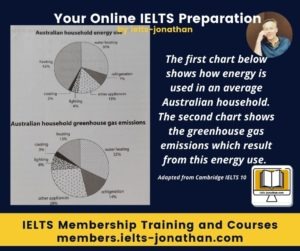
The first chart below shows how energy is used in an average Australian household. The second chart shows the greenhouse gas emissions which result from this energy use.
Summarise the information by selecting and reporting the main features and making comparisons where relevant
My Sample Answer for this IELTS Task 1 Chart
The charts show the energy consumption of an average Australian household and the proportion of resulting gases from each type of activity.
Overall, it is clear from both charts that heating in general results in proportionately less of the resulting gas emissions, whereas refrigeration, lighting and the use of other appliances result in higher emissions proportionally.
By looking at the average energy use of an Australian household we can see that heating takes up the lions share and is the largest percentage at 42% This is followed by the heating of water which stands at 30%. The use of other appliances is much smaller at 15% Refrigeration accounts for 7 percent, followed by lighting and cooling at 4% and 2% respectively.
By comparison when looking at the emission of greenhouse gases it is clear that the heating of water results in the largest emissions at 32%. Other appliances and refrigeration account for much higher emissions than their energy use. For example, other appliances account for 28 percent of emissions but just 15 percent of energy use and for refrigeration, the figures are 14 and 7 percent respectively. Emissions from lighting is also high, at 8 percent compared to 4 percent of energy use while emissions from cooling (3%) is almost comparable to the energy used at 2 percent. A last point to make is that while heating accounts for 42 percent of energy used, it only results in 15 percent of greenhouse emissions.
243 Words
Adapted from Cambridge English IELTS 10, 2015
I’m Jonathan, an online-IELTS preparation specialist.
I help IELTS students achieve the IELTS score they need with courses, training, feedback and advice.
I have taught IELTS and University English in more than a dozen universities and schools around the world.
I’m a parent, traveller and passionate about language teaching and helping students achieve their dreams.
Whilst living in Austria or working in Asia, I run IELTS courses to help students get to where they want to be.
If you are serious about IELTS, connect with me to see how I can help you.


Was this helpful? Leave a comment :)