How to notice key features for a main body paragraph
What is the purpose of the main report paragraph
Perhaps the most important paragraph and the most difficult to write well is the main body of the an IELTS report.
The main body is the section where key figures or points are used to illustrate the significant information in the visual.
Unlike the overview, which is a summary, the main body is a selection of important points, and can be problematic for many students.
Selecting the wrong information can result in a poorly written paragraph which can affect the whole band score which could limit you to just IELTS Band 4 in Tasck Achievement.
What are key features in IELTS
Key features should be obvious and a genuine IELTS test question should provide them. It should only take a few minutes to see the key features and it’s still a good idea to mark or circle these on the question paper so you remember them as you are writing.
Different visuals will require a different strategy and the key features will be different too.
Bar charts, Graph and Pie are concerned with numbers, amounts, percentages, and time periods. Key features may be the highest and lowest numbers, figure changes in a trend over time or a comparison of percentages
Tables are primarily concerned with numbers relating to categories and these will often have dates associated with them
Maps and plans may focus on changes in the past, present or future so key features are these changes and the language to describe location, direction and movement.
Processes and diagrams feature stages and so a key feature will be each stage and the specific language to describe these stages such as passive sentences or active sentences depending on whether the process is man-made or natural.
Multiple charts can have a variety of visual information and may require a combination of these task strategies.
You may have to report percentages in a pie chart and consider changes in a smaller map or plan but this task should not be any more difficult than any others.
Finally, depending on the information, you may need to decide on having one or even two paragraphs so you can organise key features logically.
What is a good IELTS report paragraph
A good report paragraph is one that is selective, organised and shows progression.
It is important to include specific data related only to KEY Features and not to make a list of numbers for example.
The IELTS band descriptors describe how the candidate should summarize the key features
Only summarise the key features and ignore the minor ones.
So, for example, you can mention details such as
‘imports decreased by 30%, sales went up from £40 to £80, numbers peaked at 500/ in 2010, or inflation rose by 5%,
but don’t report everything or you will just have a list of numbers that is difficult to read.
The IELTS band descriptors also describe how the candidate should make comparisons of the key features.
You should analyse and make comparisons but only ‘where relevant‘
So a comparison may not always be possible.
Students that strive to make comparisons often end up reporting minor details or changes.
If a comparison is possible, it will be obvious to you!
Avoiding irrelevant and minor details
Remember that students who try to make comparisons which are unnecessary often end up reporting minor details or changes.
If a comparison is possible, it will be obvious to you!
It’s the same for students that try to view every detail as important.
If there are many small changes in a graph, you can say it fluctuates.
If there are minor differences in bar chart numbers, you can say the numbers are similar, and so on.
In these cases, reporting the numbers would be irrelevant and they would spoil the progression of your writing.
Remember that the Key Features are important and NOT your opinion.
You might be lucky and have some general knowledge or expertise regarding the question you’re given.
This may help you read and understand the data. You might disagree with the data too.
You may understand why a change or feature presented in the chart has happened but DON’T express that opinion.
You will lose marks as you will probably be using your own viewpoint and not referring to the question data.
Never say that the data is wrong, just report what you see.
Sentences such as these,
‘In 2000 only 20% of UK citizens owned an Android mobile phone, whereas 10 years later this number had trebled to 60%.
In 2001 30 per cent of British households had an internet connection but by 2016 this percentage had risen to 80%.’
are good, but remember don’t compare every number, figure or change.
It is important to use linking words for cohesion and coherence but this is unnecessary for every sentence.
In fact, too many linking words can sound unnatural!
You are looking to arrange your work logically, with just enough signalling words to help the reader.
How to organise key features in a text using an example
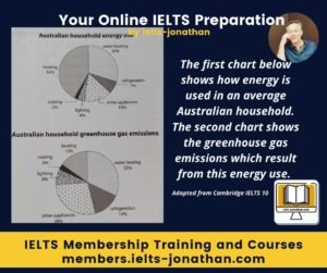
Let’s look at an example together and see the process that I took to identifing the key features in these pie charts.
The first thing I needed to do was to establish the relationships between the pictures.
I made a mental note that one chart was concerned with the use or the consumption of energy, and that the second was the result, or the emissions of the previously noted consumption percentages which means the tasks require a comparison between the figures in the two charts only.
As no time or date is given I decided to use the present tense only to report any differences or changes.
I spent some time looking at the figures in the first chart, and noting the largest percentage, the percentages that were large and similar, and then looked at the lowest figures.
I noted that the information is displayed slightly differently in the second chart, but I repeated the process, noting the largest percentage, the percentages that were large and similar, and then looked at the lowest figures.
I decided in order to keep the writing simple and to show progression, I would report from the highest to the lowest the figures found in the power consumption chart and then to compare or contrast, I then reported the figures in the second chart in a similar way from the highest to the lowest.
To signal that I was comparing or contrasting, I also used a contrasting linking word at the beginning of the paragraph.
In the paragraph, I noted that the highest consumption resulted in the highest emissions BUT then went on to show that the other figures in the emissions chart, as a percentage, were higher than the comparable consumption figures.
I was careful not to speculate or introduce any personal knowledge about this subject and simply reported the figures or facts.
By looking at the average energy use of an Australian household we can see that heating takes up the lions share and is the largest percentage at 42% This is followed by the heating of water which stands at 30%. The use of other appliances is much smaller at 15% Refrigeration accounts for 7 percent, followed by lighting and cooling at 4% and 2% respectively.
By comparison when looking at the emission of greenhouse gases it is clear that the heating of water results in the largest emissions at 32%. Other appliances and refrigeration account for much higher emissions than their energy use. For example, other appliances account for 28 percent of emissions but just 15 percent of energy use and for refrigeration, the figures are 14 and 7 percent respectively. Emissions from lighting is also high, at 8 percent compared to 4 percent of energy use while emissions from cooling (3%) is almost comparable to the energy used at 2 percent. A last point to make is that while heating accounts for 42 percent of energy used, it only results in 15 percent of greenhouse emissions.
243 Words
Adapted from Cambridge English IELTS 10, 2015
Student errors in selecting Key Features
This is not the only approach and each task will require a different strategy. This just takes practice and often you need someone to tell you about your mistakes and errors to improve.
To summarise this section:
- The key features will depend on the task type and will require a different approach
- Not every feature is Key, you need to judge is something is a minor detail
- A comparison might not always be necessary
- Never introduce your viewpoint
- Only report what you can see
Finally, let’s look at some practical errors to avoid by looking at this chart.
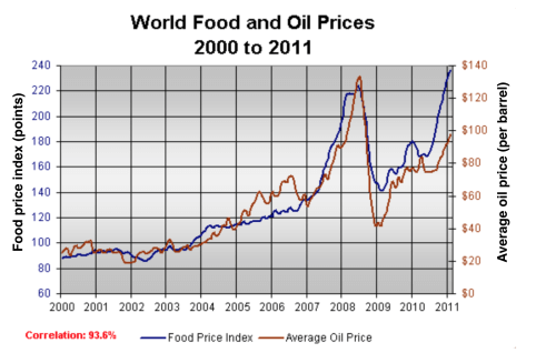
Let’s consider some sentences that you could typically use to describe the graph below.
The graph below shows changes in global food and oil prices between 2000 and 2011.
First of all, as you can see, the graph is extremely complex with detailed information but don’t worry though.
Typical student errors and mistakes
It would be impractical to report this much detail in any Task 1 Report. You don’t have the time and there is too much unnecessary detail.
Sadly however, I have seen attempts to do just that. 🙁
So let’s be honest, even an industry expert would only focus on the significant details, and that what the IELTS examiner wants you to do too.
If your try and report as much detail as you can, because you think the examine will see great grammar and vocabulary, you’re mistaken.
The examiner will immediately mark you down.
The trick is to focus on the most significant numbers or features.
In other words,
Ignore the minor details, just report the main ones.
Practicing identifying the important features
So lets look at some sentences and see how these sentences identify the key details.
Example Sentences using the imageA sentence about the year 2000:
In the year 2000, the average global oil price was close to $25 per barrel, and the food price index stood at just under 90 points.
A sentence about the years 2000 to 2007:
Over the following four years both prices remained relatively stable, in spite of frequent small fluctuations, before rising steadily between 2004 and 2007.
A sentence about the year 2007:
By 2007, the average oil price had more than doubled, to nearly $60 per barrel, and food prices had risen by around 50 points.
A sentence about the years 2007 to 2008:
A dramatic increase in oil and food prices was seen from 2007 to 2008, with oil prices reaching a peak of approximately $130 per barrel and the food price index rising to 220 points.
A sentence about the year 2009:
By the beginning of 2009, the price of oil had dropped by roughly $90, and the food price index was down by about 80 points.
Task:1
Can you write one correct sentence about oil and food prices in 2011?
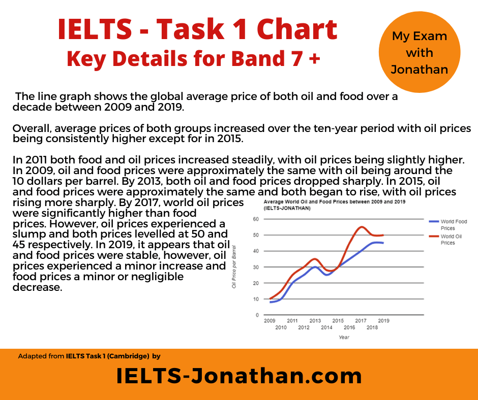
In 2011 both food and oil prices increased steadily, with oil prices being slightly higher.
What about writing a sentence to describe 2009
In 2009, oil and food prices were approximately the same at around the 10 dollars per barrel.
Now write a contrast about 2013 and then a sentence describing 2015, 2017 and 2019
My examples
In 2013, both oil and food prices dropped sharply.
In 2015, oil and food prices were approximately the same and both prices rose, with oil prices rising more sharply.
In 2017, world oil prices were significantly higher than food prices. However, oil prices experienced a slump and both prices levelled at 50 and 45 respectively.
In 2019, it appears that oil and food prices were stable, however, oil prices experienced a minor increase and food prices a minor or negligible decrease.
Let’s look at the final written report. 🙂
Notice that I have included an introduction and overview.
Then I have used the key details form the chart for the body of the essay.
Final Report
The line graph shows the global average price of both oil and food over a decade between 2009 and 2019.
Overall, average prices of both groups increased over the ten-year period with oil prices being consistently higher except for in 2015.
In 2011 both food and oil prices increased steadily, with oil prices being slightly higher. In 2009, oil and food prices were approximately the same with oil being around the 10 dollars per barrel. By 2013, both oil and food prices dropped sharply. In 2015, oil and food prices were approximately the same and both began to rise, with oil prices rising more sharply. By 2017, world oil prices were significantly higher than food prices. However, oil prices experienced a slump and both prices levelled at 50 and 45 respectively. In 2019, it appears that oil and food prices were stable, however, oil prices experienced a minor increase and food prices a minor or negligible decrease.
Are you looking for IELTS guidance?
I offer useful feedback and advice through my Writing Service.
Many students have used this service and I love the feedback they got.
I hope that you found this information useful and you have taken on board some of the tips.
You can share to someone you know and in the meantime take a look at my
Facebook Page and Website for IELTS answers and you can also join my Facebook Group here too.
I also recommend taking a look at my free blog below, or sign up to my Newsletter which gives further instruction on how to write that perfect Writing Task 1 overview:
The Best Approach to Task 2 Writing Paragraphing in Task 2 Writing Writing – Benefits of a Foreign University Education I’m Jonathan I’ve taught IELTS and University English in more than a dozen universities and schools around the world. I’m a parent, traveller and passionate about language teaching and helping students achieve their dreams. Whilst living in Austria or working in Asia, I run IELTS courses to help students get to where they want to be. If you are serious about IELTS, connect with me to see how I can help you.


Was this helpful? Leave a comment :)