A growing collection of IELTS Essays exemplars
In order to learn how to write a great Task 1 or Task 2 IELTS, you do need to read examples and notice language and structure.
Reading good examples of Task 1 responses will give you a sense of the organisation of good writing and approaches to the different questions in IELTS Task 1
You will also gain an idea of structuring sentences and the logical presentation of data.
What these IELTS essays will do for you
In these explainers, I try to guide you how I would answer a number of different question types, and my rationale for arranging information.
This is not the only method, but it is the one I use for a well-written IELTS Task 1 report.
As I have said, it is a good idea to read widely and only use reliable examples from published books or from this website.
On many online websites, too often you will find mistakes with the task approach, language appropriacy errors, grammar discrepancies and often the language is outdated, inappropriate or wrong.
So I hope you find this growing collection useful to your studies and if you have any questions, you can leave a comment and I will get back to you. 🙂
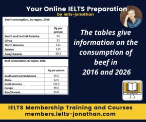
The tables give information on the consumption of beef in 2016 and 2026
My approach to this task
This week, it’s a table. Two dates, past and a future time, 5 categories, but what are they? What are they called? Seems quite a straightforward task but just requires some good organisation and a decent summary/overview paragraph.
Here’s my own step by step process of anyalsing and writing this IELTS Task 1 table question.
In these tables, the information is laid out quite clearly and looks at first glance as easy to interpret data.
The numbers refer to beef consumption, measured in kilograms of beef consumed per person in five areas of the globe. These are individual continents or two continents classified together.
There are two dates that can be clearly seen in the introduction and in the legend. One is the past and one refers to predictions/likely figures or numbers or could be regarded as estimated figures in 2026. The vocabulary choices to describe 2026 are my decision, however, what is clear is that a future tense is required.
Now that I felt I had a good understanding of the chart’s purpose, I was able to write a short but purposeful introduction which paraphrases some of the question.
I decided that I could make the introduction better by clearly referring to the two key dates. This would help display my lexical and grammatical range and ability.
I then moved on to the figures to try and interpret these and see if I could find or spot a clear summary or trend to report.
This would not only help me to write my summary but also give me a better understanding of how to arrange the data in a main body paragraph.
At this point I was confident that there did not seem to be an immediate challenges to this task – it seemed quite a straightforward task that just requires some good organisation and a decent summary/overview paragraph.
In this example, I looked at the figures in 2016 and noted these from the highest to the lowest figures. I then did the same with the predicted figures.
Once I had done this it was very clear to me that the order (from highest to lowest) was not the same in 2016 and 2026.
I could, of course, read this information, but making precise notes helped me to form an overview AND would help me to report the figures accurately.
I was able to say that the overall consumption of beef is likely to decrease over the two dates, but there is one exception, which was Africa.
So this became the basis of my summary or overview of the chart: that there is an overall decline.
The next challenge was how to report the figures.
It is important to report all the key figures and in a table question this means all of the numbers. The simplest and probably the most effective way to report the 10 numbers was to report them from the lowest to the highest or from the highest to the lowest.
I realised from my notes that there was an interesting comparison that I could make regarding a low number, so to illustrate this contrast I decided to report from the highest to the lowest and to do this in two separate paragraphs, for 2016 and 2026.
I made sure I reported all the key figures by referring to the continents and the figures. I wasn’t worried about the progression or the writing as I believe the arrangement of the dates and the division into two paragraphs helps the reader to progress through the text.
To finish the main paragraph, I, of course, included the 2026 figure for Africa and included a contrasting linker to state that this figure is the exception to the other continents. In this example, the figures increase.
I felt this added value to the essay and if I had not made my original notes, the opportunity to display language may have been missed. 🙂
Finally, I made sure that I spent five minutes checking my work for coherence, cohesion, grammar, spelling and punctuation.
Job done! 🙂
My Task 1 table response
The two tables show how many kilograms of beef is consumed per person on five continents. The figures refer to 2016 and, at the time of writing, show the predicted figures for 2026.
While there may appear to be overall increases in predicted consumption figures, in actual fact, the overall total shows a slight decline in the consumption of beef due to a substantial drop in the amount of beef consumed on two continents.
In 2016, North America and Europe consumption was the highest at 111 and 115 kilos per person. South and Central America and Asia/Oceania figures were both similar at 61 kg and 58.kg respectively. Finally, in 2016, Africa consumed the least beef per head at just 31 kg per person.
By 2026, it is predicted that the figures North America and Europe will have decreased significantly from 111 to 105.5, and 115 to 98.5 respectively. In contrast, South and Central America and Asia/Oceania consumption will increase from 61 to 65.5 and 58.2 to 61.8. The most significant change is in Africa. By contrast, in this continent the consumption of beef is predicted to increase from 31 to 41.5 kg per person.
Word Count 203
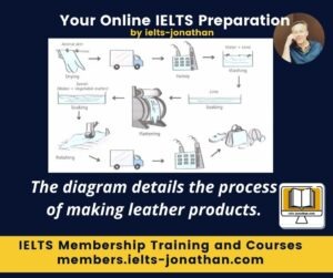
The diagram details the process of making leather products.
My Approch to this task
The first step to answering this task was to gain an overall picture or perspective of the task.
I realised that while there is quite a lot happening in the diagram, it would not be too difficult to report this diagram.
The biggest challenge would be to produce a text that was different to other student reports, carefully selecting appropriate grammar and I would also need to access language not available in the visual.
The easiest thing to do after gaining an overall understanding of the task, was to paraphrase what the process was showing.
By gaining an overall understanding it was clear that this process moves from using raw materials to producing products that are ready for retail.
Using this information as a paraphrase gave me the introduction for the task which describes the purpose of the information.
‘The diagram illustrates how animal skins are processed in order to produce a range of leather retail items such as shoes, handbags and toys’.
The next stage was to provide an effective summary.
Summarising a process involves identifying and summarising the kind of process and the number of stages or steps from start to finish.
So to summarise that point, I prepared an overview that would state
‘It was clear that this process is a manufacturing one, conducted in factories using machinery of some kind’ and importantly, there were the 3 main stages which were transportation, preparation and production’.
I also noted that the process is quite complex and takes a long time.
I spent some time on the overview as the overview is often the first section that examiners read, and it is the section which can be the most creative – thereby displaying your level and variety of vocabulary and grammar.
The resulting summary overview was:
‘… the diagram explains how, despite the fact that the process of treating animal skins is done mostly in factories and with the aid of machinery, it is still lengthy and complex, involving several stages before the product is ready for transportation to storage or retailer areas’.
The final stage was to report all of the stages in the diagram.
As the focus of the writing is mostly on the action and not ‘who or what’ is doing the action, I needed to check the passive forms of the verbs I would use, such as washed, flattened and taken .
Another point to be aware of is that this is the mechanical section of the writing task and so it can end up being quite dull. 🙁
To avoid this, it is important to try to paraphrase words from the chart and use signalling words to help the reader move through the text.
I used simple first, second and finally linking words to signal the main stages as well as other signals to indicate changes within the main stages, such as ‘following this’, ‘followed by’, ‘following these’, among others.
One final decision I made was to place the overview at the end of the task to compensate for the mechanical/information density of the main body paragraph – although the overview would still have been effective before the main body paragraph too.
This was a stylistic choice.
Finally, I made sure that I spent at least five minutes checking my work for coherence, cohesion, grammar, spelling and punctuation so I would not lose marks after all my hard work. 🙂
My Task process response
The diagram illustrates how animal skins are processed in order to produce a range of leather retail items such as shoes, handbags and toys.
In the initial stages of the process, the skin is dried before being taken to a tannin factory. At this stage, the raw material undergoes two forms of treatment. Firstly, it is washed with water and lime and this is followed by soaking in the material in lime. Following these two processes, the material is then flattened and then it is submerged in a tannin solution. The last production stage involves polishing the leather using a roller. Finally, the resulting product is subsequently transported to a processing factory where they are made into a number of different products in preparation for shipping.
Overall, the diagram explains how, despite the fact that the process of treating animal skins is done mostly in factories and with the aid of machinery, it is still lengthy and complex, involving several stages before the product is ready for transportation to storage or retailer areas.
Word Count 172
More Task 1 Essay Explainers
The chart below shows the total number of minutes of telephone calls in the UK, divided into three categories, from 1995 – 2002.
The two pie charts compare the main household expenses of Australian consumers between 1970 and 1990
The first chart below shows how energy is used in an average Australian household. The second chart shows the greenhouse gas emissions which result from this energy use.
The tables below give information about sales of Fairtrade-labelled coffee and bananas in 1999 and 2004 in five European countries.
The diagrams below show the site of a school in 2004 and the plan for changes to the school site in 2024.
The two charts below show what UK graduate and postgraduate students who did not go into full time work did after leaving college in 2008.
The diagram below shows how instant noodles are manufactured.
The chart below shows the amount of money per week spent on fast foods in Britain.
I’m Jonathan
I’ve taught IELTS and University English in more than a dozen universities and schools around the world.
I’m a parent, traveller and passionate about language teaching and helping students achieve their dreams.
Whilst living in Austria or working in Asia, I run IELTS courses to help students get to where they want to be.
If you are serious about IELTS, connect with me to see how I can help you.


