Are IELTS Task 1 Multiple Chart Questions really a challenge?
Hi, I’m Jonathan.
In this post, I’m going through a typical Multiple Chart question in IELTS and work towards a high-scoring answer.
If you follow my advice, you will find that this type of question won’t as difficult as you might first think.
This will give you an answer that gets a high Task 1 band score.
By following this post, the same principles can also successfully be applied to other IELTS Task 1 questions
Before you get started, look at these articles first.
If you are okay with this content, continue to the next section.
Key Principles to Multiple Charts
The key principle to writing about multiple charts is noticing the main trends in both images.
You then need to report, as much in your own words, the key details in all the images, being careful to omit minor details.
For this type of essay it is standard to write a four paragraph report, namely
An Introduction,
An Overview (1)
Body Paragraph
Body Paragraph
The Overview (1)
The overview (1), or the trend of all the images can come at the end, but my preference is between the introduction and body paragraphs.
Writing about Multiple Charts
This type of question is very visual.
Many students don’t prepare for this type of question, but the good news is, preparation for this task won’t take as long as you might think.
Good News!
These questions follow the same format as any IELTS Task 1:
This is
- Introduce the images
- Give an overview of the main point/s (Band 6 and above)
- And provide the detail for all the images
This post will explain:
- Types of question
- The tried and tested method for these questions
- How to write the introduction
- How to add a great overview
- How to write about the detail
- The common mistakes IELTS students make
What is a Multiple Chart Question?
There is no standard type of multiple chart question.
Official IELTS practice questions have featured a map of a city showing expansion of time with a table, line graphs and bar graphs together, multiple pie charts or multiple tables or any combination of these.
When you see a question like this, it may seem very challenging.
The good news is once you understand the tried and tested method, then these questions won’t be any more challenging than any other IELTS Task 1 question.
Let’s consider a typical question first.
A Good Teacher’s Guide to IELTS Planning.
Any good teacher will tell you that to be effective in Task 1 you need to
- understand the task quickly
- plan an answer quickly.
You can do this like so:
Get an overall visual understanding of the charts.
- Paraphrase the question
- Consider an overview and write it!
- Identify the key features in both images
- Include time to proofread your writing
Gaining an overall understanding
It should be quite easy to understand the charts by reading the question explainer.
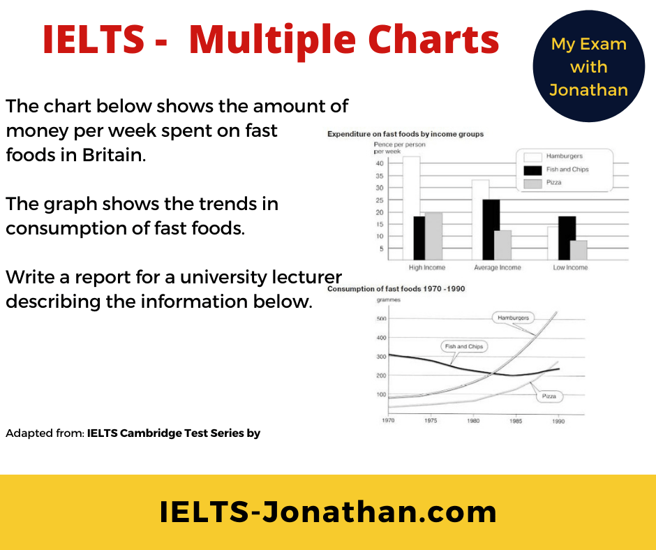
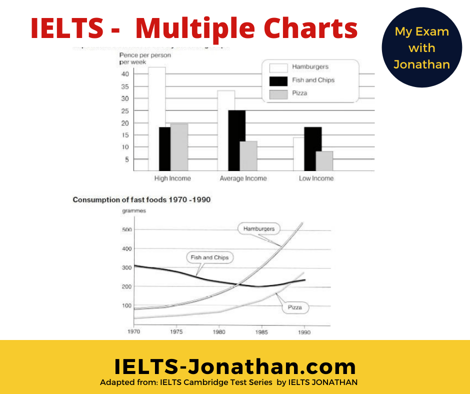
The chart below shoes the amount of money spent per week on fast foods in Britain.
The graph show the trends in consumption of fast foods.
The next step is to look at the charts in more detail and begin to notice any individual trends or trends connecting the images.
In the example we are using, these differences are fairly obvious.
Noticeable features are the increase food consumption of two food items, and a pattern in the type of food consumed depending on the income group.
Great!
We can use this for our overview later.
It may not always be as clear as this however, and you may need to look more carefully to notice the trends for your overview.
It’s quite a challenge to write about something you have never seen, so it is important that you look at a number of samples to gain a good understanding of how these tasks might vary.
Don’t worry, it doesn’t need to be perfect, you only have 15 minutes and just need to notice the main features and report them in an accurate way.
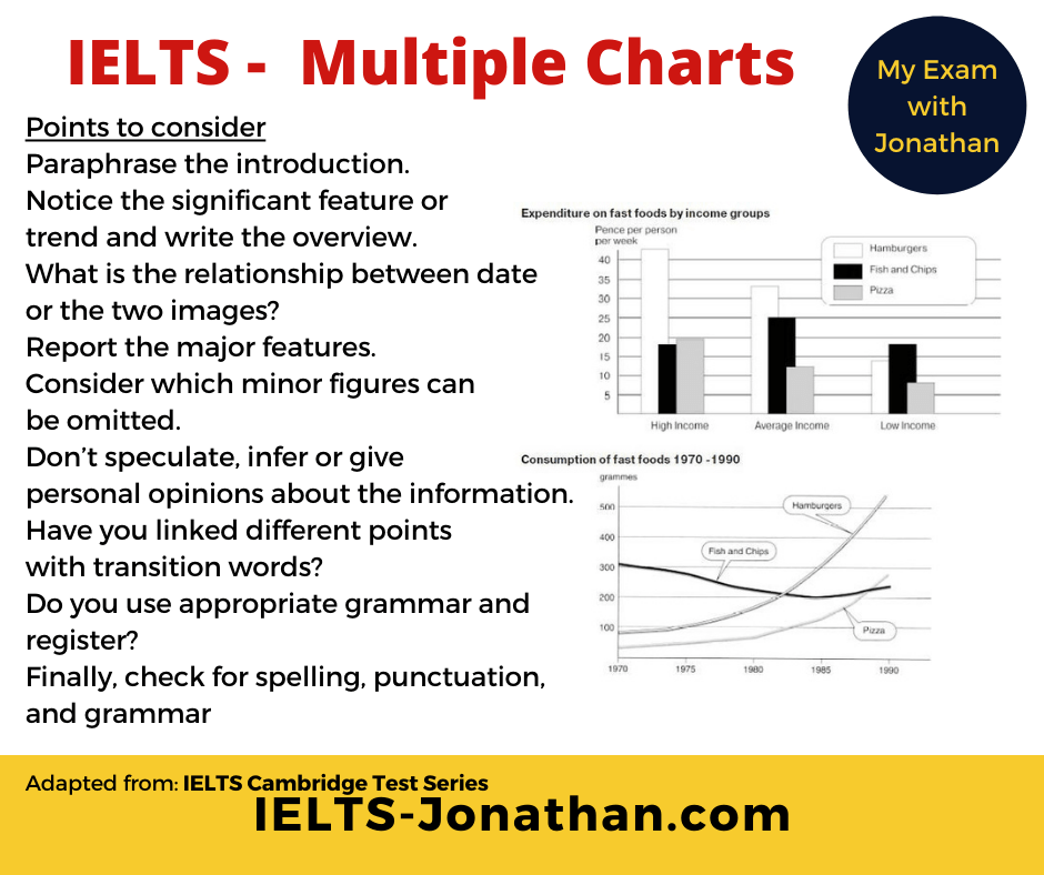
TOP TIPS for understanding
- Read the question rubric carefully
- Be clear on the groups and measurements used
- Be clear on the time periods for each image
- Identify the obvious features and changes in each chart
- Ask, is there a relationship connecting the charts?
- What are the Key and Minor details
By answering these questions, you will have already started planning your essay
Good News – Remember the IELTS task is not there to trick you.
Often a task looks overly difficult because it contains many minor details.
Your task is to report effectively and accurately the overview and key details.
Introduce the Charts
Any chart question will follow the same format. There will be some general information (1) , followed by the instructions (2)
(1) The chart below shows the amount of money per week spent on fast foods in Britain.
(1) The graph shows the trends in consumption of fast foods.
(2) Write a report for a university lecturer describing the information below.
Write at least 150 words.
Top Tip
As with any Task 1, you can begin by paraphrasing sentence (1) of the instructions.
Paraphrasing for IELTS means using different words and/or word order from the instructions, so the original meaning remains the same.
It is a task worth learning to do well.
Knowledge about paraphrasing will also help you in the Reading, Listening and Speaking part of the test.
In order to remain the same, different words need to be synonyms, so man, male and person have a similar meaning, they are synonymous, but man, male, person and girl are not.
Original
The chart below shows the amount of money per week spent on fast foods in Britain.
The graph shows the trends in consumption of fast foods.
Example 1
The first chart presents how many grammes three different income groups spent on three different types of fast food and the second chart shows how the popularity of each fast food type has changed over twenty years.
Example 2
The two charts show patterns in consumption of three types of fast food over two decades and the amount three different income groups spent in grammes on these three types of fast food.
As you can see, all the information in the two sentences has been taken from the question, but it has not been copied.
Additional information from the the images has been included too!
If you simply copy the instructions then these words are not used towards the word count.
You could fail on TASK ACHIEVEMENT. 🙁
You need to write this section in your own words.
This is my example
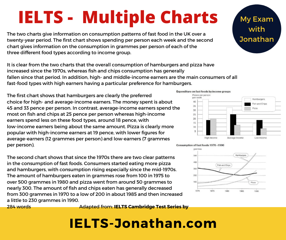
The two charts give information on consumption patterns of fast food in the UK over a twenty-year period. The first chart shows spending per person each week and the second chart gives information on the consumption in grammes per person of each of the three different food types according to income group.
In any Academic Task 1 question, you can rewrite (paraphrase) the questions and this will be the first paragraph.
Well done!
You can then move on and consider the next section, the overview.
Overview of the Charts
The ‘public band descriptors’ say to achieve a Band 6 or above for ‘Task Achievement’ the student must provide an overview in Task 1.
Without one, after averaging the four band scores, you are less likely to get a high score.
If you started planning at the beginning, then writing a good overview is easy.
You should have sufficient information to provide the 1 or 2 sentences to construct the basic overview.
Recap:
- Identify the obvious trends from all the images
- Be clear on the time periods
- Ask, is there a relationship connecting the charts
- What are the Key and Minor details
- Select the most important differences to write about first
Remember, we noted that there was an increase in food consumption of two food items, and a pattern in the type of food consumed depending on the income group.
Good!
We will use this for the overview.
The Overview
The overview can come just after the introduction or at the end of the report.
It makes a general statement about the main differences between the images.
The overview is quite short, maybe about 1, 2 or 3 sentences.
My overview
It is clear from the two charts that the overall consumption of hamburgers and pizza have increased since the 1970s, whereas fish and chips consumption has generally fallen since that period. In addition, high and middle-income earners are the main consumers of all fast-food types with high earners having a particular preference for hamburgers.
I think it is clear, I have written about the main trends in both images, but I haven’t included any details.
I have saved these details for the next paragraphs.
Excellent!
Providing the Detail
Now that you have completed paraphrasing the question and given the overview, the next stage is to explain the Key Features in each of the images.
Depending on the visual information, you can use the same techniques as you would for a Pie Chart , Line Graph or Table, for example.
You can do this by:
- Stating the significant changes in a Graph
- Stating the significant proportions in a Pie Chart
- Stating the highest and lowest numbers in a Table
- If you have a Map, state the developments over time.
You need to report the Key Features and omit the minor details.
As you only have 20 minutes and about 150 words to play with, you need to be more selective with the information you choose to include.
The Body Paragraphs
Lets’ look at the Key Features I’ve chosen to include.
In the first paragraph, I have concentrated on describing the Bar Chart and have focussed on describing the most significant feature first. (hamburgers- preferred choice for High-Mid income groups).
Next, I mention the Fish is most popular with Mid earners, followed by High and Low earners.
Finally, I state that Pizza is the most popular with High, then Mid and finally Low earners.
In the second paragraph, I have decided to focus on the Graph and have included information I mentioned in my overview.
I have stated that pizza and hamburgers have increased.
I am writing about Key Features, so I have included the figures as approximates.
I have also noticed the decrease in Fish and have included Key Details too, but I have not reported every change.
Varying your language
One final tip for a higher score is variation in language. I can do this by using synonyms, or by changing the word order and grammar.
Here’s a basic example;
The two charts give
The first chart shows
The second (chart) shows
Obviously, I cannot use a synonym for Hamburger, as there is only one word for this.
I am not worried about repeating Fish or Pizza either. This is the only way to describe these food items.
You will often find the same problem in other IELTS questions.
Common IELTS Errors
Pay attention to reading both the question and the visuals carefully.
Often they will refer to different periods of time.
You need to accurately report the information using the correct tense.
If one visual has no time period given, then use the present tense to report its features.
This is a standard feature of academic writing.
In the bar chart I have used the Present Simple Tense because no time period has been given.
In the graph, by contrast I have used the Past Simple to describe points on the graph, and I have used the Present Perfect Tense when I want to describe a change over a period of time.
Common IELTS Errors 1
Just because you have included an overview, does not mean you can’t include those details again.
This time though, it’s important to include figures to support your summary writing.
In my example, I noticed Hamburger and Fish ( consumption) increased in my overview, but as a Key feature I have included Key Details such as year and the amount in grammes.
Common Grammar Errors
A very basic error seen in Task 1 introduction is basic verb agreement.
Look at the two genuine examples below
The map show
The maps shows
In both examples it is unclear about the number of nouns discussed i.e, the number of maps.
You need to be consistent throughout your writing.
Other common errors in subject agreement can happen
It has They have
It is They are
It shows They show
It has (auxiliary verb) + Verb They have (auxiliary verb) + Verb
When you have a short time to write, this is a surprisingly common mistake in Task 1 writing!
Noun Phrase Errors and prepositions
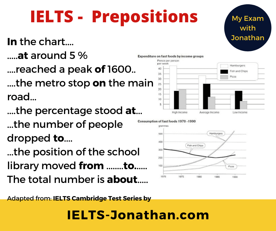
It’s always a good idea to refresh your memory of these small words. It is surprising how the wrong preposition can spoil a good sentence in English.
Common Errors – No overview
Did you focus on understanding the task and the details, and then forgot to include an overview?
Don’t worry, make sure you write it at the end
Finally, check your essay!
Ideally, you need to allow 3 to 4 minutes at the end of the test to check and improve your writing.
Often students don’t check their work because they spend the full 2o minutes writing.
It is far better to write for about 15 minutes and allow 5 minutes to check and improve your writing.
From my experience the points you should check for are:
- Are there any obvious spelling or punctuation errors?
- Are the verbs the correct tense?
Additionally, you should consider these questions, but if you followed my planning advice, you should be ok.
- Do the verbs agree with the subject?
- Does the description make sense? Does it follow the visual?
- Is there any repetition in vocabulary?
- Could this be improved with synonyms?
- Have I written over 150 words?
- Have I organised the text into at least 4 paragraphs?
- Have I noticed only the Key Information from both (or more) charts?
- Have I omitted the Minor Details which could lower the Band Score?
- Have I included the prominent features in the overview?
- Have I NOT included my personal opinion?
Once you have done this, be proud of the final product!
Here’s my sample answer in full.
The chart below shows the amount of money per week spent on fast food in Britain.
The graph shows the trends in consumption of fast foods.
Write a report for a university lecturer describing the information shown below
Write at least 150 words
The two charts give information on consumption patterns of fast food in the UK over a twenty-year period. The first chart shows spending per person each week and the second chart gives information on the consumption in grammes per person of each of the three different food types according to income group.
It is clear from the two charts that the overall consumption of hamburgers and pizza have increased since the 1970s, whereas fish and chips consumption has generally fallen since that period. In addition, high and middle-income earners are the main consumers of all fast-food types with high earners having a particular preference for hamburgers.
The first chart shows that hamburgers are clearly the preferred choice for high and average-income earners. The money spent is about 45 and 33 pence per person. Average-income earners also spend the most on fish and chips at 25 pence per person. High- income earners spend less at 18 and low-income earners at about the same amount. Pizza is clearly more popular with high-income earners at 19 with lower figures for average-earners and low-earners at 12 and 7 grammes per person.
The second chart shows that since the 1970s there are two clear patterns in the consumption of fast foods. Consumers started eating more pizza and hamburgers, with consumption rising especially since the mid-1970s. The amount of hamburgers in grammes rose from 100 in 1975 to over 500 grammes in 1980 and pizza went from around 50 grammes to nearly 300. The amount of fish and chips eaten has generally decreased from 300 grammes in 1970 to a low of 200 in about 1985 and then increased a little to 230 grammes in 1990.
284 words
If you are taking your test soon, then Good Luck with you IELTS Preparation,
Jonathan




Was this helpful? Leave a comment :)