Understanding IELTS Line Graphs Task 1
Before you start learning how to describe line graphs in IELTS Task 1,look at these articles first.
If you are familiar with the content, go to the next section.
IELTS TASK 1 Describing changes and trends
IELTS TASK 1 Working correctly with numbers
IELTS TASK 1 Increase your band score with Adjectives/Adverbs
IELTS TASK 1 Using Compare and Contrast language
Line graphs
Line graphs usually two main features that you need to notice – the comparison of two or more units or numbers in the same year, or charts that show changes over a period of time.
For this type of essay it is standard to write a three or four paragraph report.
Namely; The Introduction, the Overview and Two Bodies
Have a look at my articles below if you need further information
You can now study the line graphs below and look at the suggested structure:
Writing about Line Graphs
Line Graphs are one of the more common types of question in Task 1 IELTS.
However, visual questions often seem easy to answer, so students often prepare less for these questions
It really is important to prepare for all types of IELTS questions.
The good news is that the preparation won’t take as long as you might think.
All Line Graph will require you to describe a trend within the graph and to compare it to another line.
A Line Graph may represent a period in the past but may also include projections about future trends.
It’s important to use specific vocabulary such as verbs and nouns, as well as adjectives and adverbs, related to the task.
The grammar might be the past tense and present necessary to describe trends.
If the trend is in the future, the future simple should be used.
You would also need to use specific language such as prepositions of time.
Good News!
Line Graph Questions follow the same format as any IELTS Task 1 Question:
This is
- Introduce the Line Graph
- Give an overview of the main point/s (necessary for Band 6 and above)
- And provide the detail
This post will explain:
- The types of Line Graph question
- The tried and tested method for answering any map question
- How to write the introduction
- How to write about the detail showing trends and time
- How to finish with a great overview
- The common mistakes IELTS students make
What is an IELTS Line Graph Question?
These questions can be divided into two types: past, present and future trends.
Official IELTS practice questions have featured economy, population, health, technology, education and sales among others. In fact, anything where trends can be described.
More good news is that the same skills and principles can be applied to any graph, whether in the past or future
Let’s consider a typical question first.
A Good Teacher’s Guide to IELTS Planning.
Any good teacher will tell you that to be effective in Task 1 you need to understand the task quickly and plan an answer quickly too. You can do this like so:
Get an overall visual understanding of the map.
- Paraphrase the question
- Consider an overview
- Identify the notable trends to compare
- Include time to proofread your writing
Gaining an overall understanding of the Line Graph.
A line graph may have a number of features that require vocabulary related to time, number and degree.
So, you should start at the beginning, by identifying the obvious trends.
In the example above, these differences are fairly obvious.
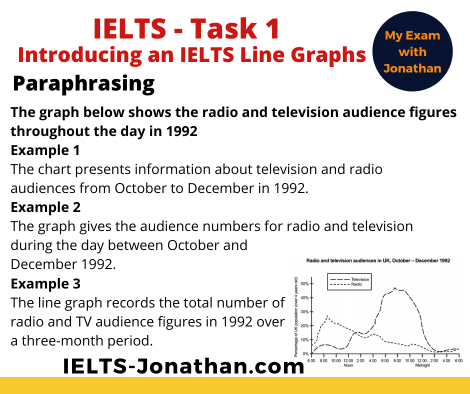
Noticeable trends are radio audiences peak in the morning and gradually decrease during the day, while TV audiences peak in the early evening and then decrease.
However, line graphs are not always as clear as this, and you may need to look more carefully to notice changes.
It’s quite a challenge to write about something you have never seen, so it is important that you look at other sample line graphs to get a good understanding of how they might vary.
Don’t worry, it doesn’t need to be perfect, you only have 15 minutes and just need to notice the main features and report them in an accurate way.
TOP TIPS for understanding
- Identify the obvious trends
- Is the trend over time going up, down or stable?
- Is it past situation or future?
- Units are usually about time, are they days, months, years or decades?
- If there is a key, what information is provided on the line graph
By answering these questions you will have already started planning your essay
Good News – Remember the IELTS task is not there to trick you, and you won’t be given a complicated process to describe.
Your task is to report effectively and accurately.
Introduce the Graph
Top Tip
As with any Task 1, you can begin by paraphrasing sentence (1)
This is the rubric or instructions.
Paraphrasing is a task that is worth learning to do well, and a good knowledge of paraphrasing will also help you in the Reading, Listening and Speaking part of the test.
Simply put, paraphrasing for IELTS means using different words and/or word order so the original meaning remains the same.
In order to remain the same, different words need to be synonyms, so Man, male and person have a similar meaning, they are synonymous, but man, male, person and girl are not all synonymous.
As you can see, all the information in the three sentences has been taken from the question, but it has not been copied.
Bad News
If you do copy directly then those words are not used towards the word count and you will fail on TASK ACHIEVEMENT.
You need to write it in your own words.
In any Academic Task 1 question you can rewrite (paraphrase) the questions and this will be the first paragraph.
You can then move on further and consider the next section, the Overview.
Overview of the Line Graph
The ‘public band descriptors’ state that to achieve a Band 6 or above for ‘task response’ the student must provide an overview in a Task 1.
Without one, you are less likely to get a high score.
If you started planning at the beginning then writing a good overview will be a lot easier near the end.
Remember, the questions I asked you to consider.
These should be sufficient to provide the 2 sentences you need to construct the basic overview.
Recap:
- Identify the obvious trends
- Is the trend upwards, downwards or stable?
- Is it past situation or future?
- Count the number of changes?
An IELTS Graph is different to a chart or table as there aren’t usually any key differences to identify.
So, as there are no differences to comment on, you should mention, for example, the obvious trend upwards, downwards or both.
Providing the Detail
Now that you have completed paraphrasing the question and given the overview, the next stage is to explain the IELTS line graph in detail.
You can do this by:
- Stating the significant trends
- Use verbs and nouns to show upward, downward trends or stability
- Use prepositions to describe time
- Use adverbs and adjectives to show degrees of change
Before you do this you need to consider the most suitable language that reflects the sophistication of the task.
Consider the most suitable language
In order to describe the process well there are three key aspects of language to be considered.
These are vocabulary, prepositions and choice of grammar.
Key Vocabulary for describing Line Graphs
1) Adverbs and Adjectives to show degree of change
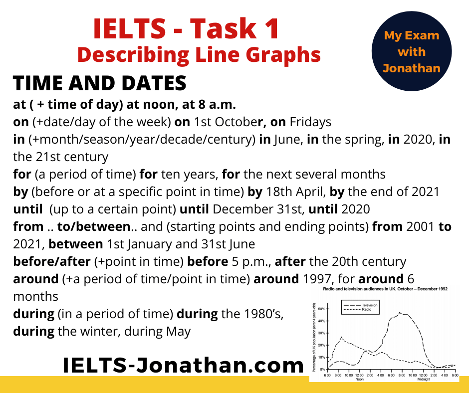
2) Prepositions of time
Line graphs require you to be accurate when referring to times on the graph.
IELTS Writing Task 1 Structure
1) Nouns and Verbs for trends
It’s important to be able to vary your language to describe changes you can see in Line Graphs.
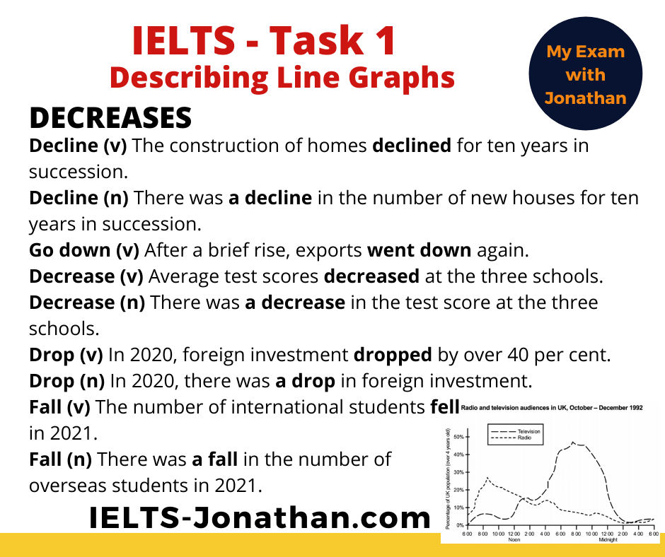
Decreases
Similarities
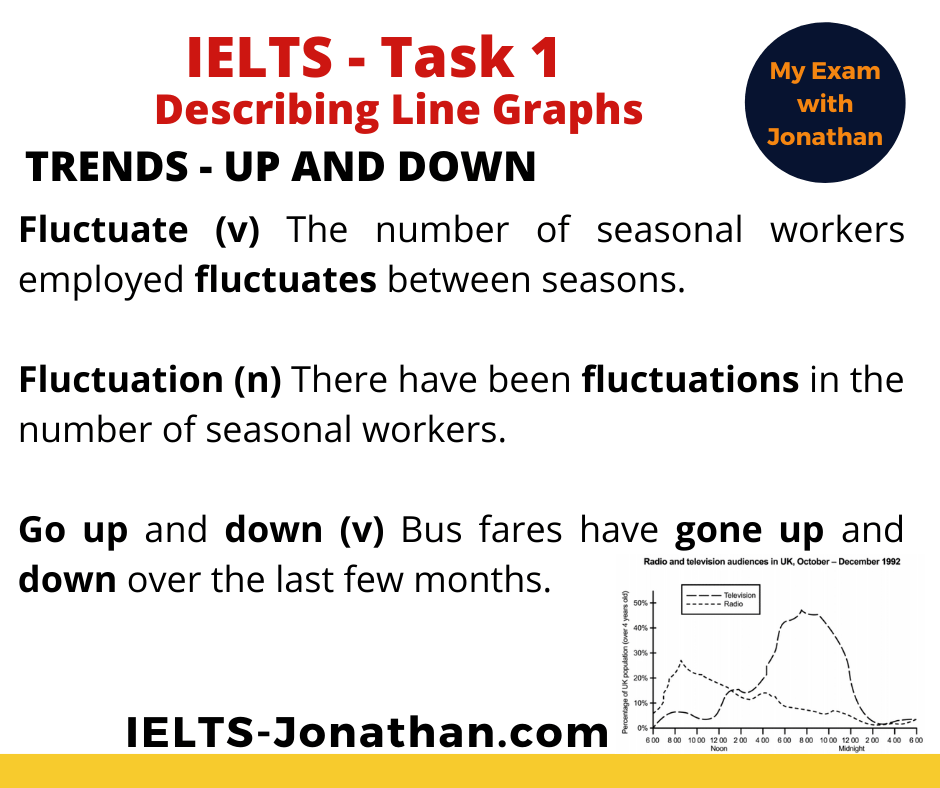
Up and Down
2) Past and future tense
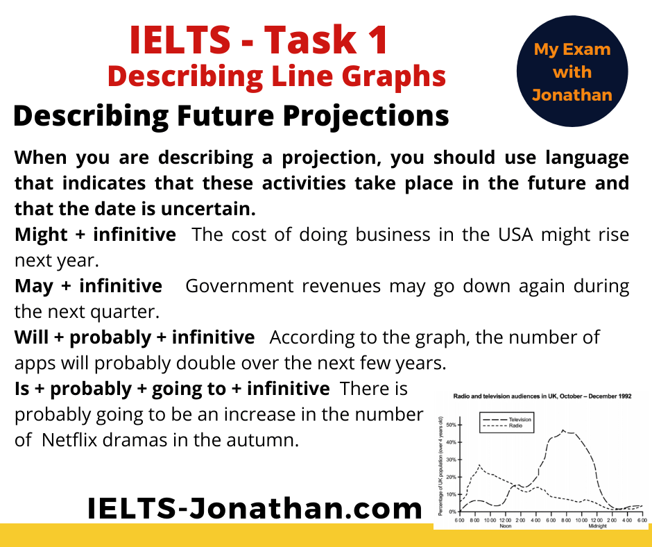
Line graphs may make predictions about the future so you should use language that indicates that these activities take place in the future and that the date is uncertain.
The Overview
The overview comes just after the introduction and makes a general statement about the main differences between the line graph.
The overview is quite short, maybe about 2 or 3 sentences.
Do not go into detail in the overview.
Now I can add the two Body Paragraphs using the language and vocabulary above.
The Body Paragraphs
Varying your language
One final tip for a higher score is variation in language.
It’s a good idea to avoid repetition when using verbs
The chart indicates the average rainfall…. The graph provides data on average rainfall...
The same can apply to nouns too,
For example,
There was a fall in the number of international students. (noun phrase)
The number of international students fell (verb)
Common Errors
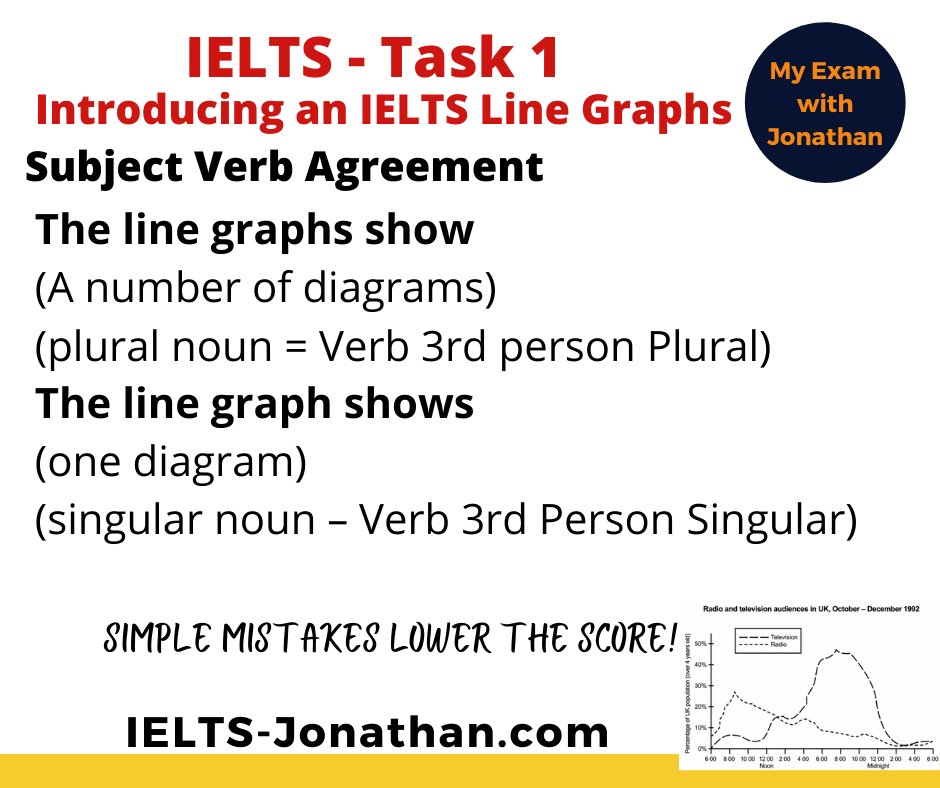
A very basic error seen in Task 1 introduction is basic verb agreement.
Look at the two genuine examples below
The graph indicate
The graphs indicates
In both examples it is unclear about the number of nouns discussed
Here is the correction:
Common Errors using the Past Simple.
- Make sure you practise the Past Simple so you know exactly how to use it.
- Singular or Plural
Notice these examples are incorrect.
There were an increase in production.
There was a declines in numbers.
This is a really common mistake In Task 1 writing!
Here are the corrections:
There was an increase in production.
There was a decline in numbers.
Finally, check your Essay
Ideally, you need to allow 3 to 4 minutes at the end of the test to check and improve your writing.
Often students don’t do this because they spend 20 minutes writing.
It is far better to write for about 15 minutes and allow 5 minutes to check and improve your writing.
From my experience the points you should check for are:
- Are there any obvious spelling or punctuation errors?
- Are the verbs the correct tense?
Additionally, you should consider these questions, but if you followed my planning advice you should be ok.
- Do the verbs agree with the subject?
- Does the description make sense? Does it follow the visual?
- Is there any repetition in vocabulary?
- Could this be improved with synonyms?
- Have I written over 150 words?
- Have I organised the text into at least 3 paragraphs?
- Have I noticed only the obvious features from the map?
- Have I included the prominent features in the overview?
- Have I NOT included my personal opinion?
Once you have done this, be proud of the final product. 🙂
Here’s my sample answer, what do you think?
The graph below shows the average radio and television audience throughout the day between October and December in 1992.
Summarise the information by selecting and reporting the main features and make comparisons where relevant.
Write at least 150 words
The line graph provides information about average 24-hour audience numbers of both radio and television in the UK over three months in 1992.
Overall, television accounts for the highest audience totals over the 24-hour period. It can also be seen that listening to the radio is primarily a morning and afternoon activity whereas watching the television is more popular in the late afternoon and evening.
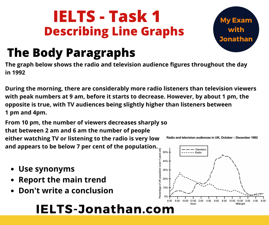
During the morning, there are considerably more radio listeners than television viewers with peak numbers at 9 am, before it starts to decrease. However, by about 1 pm, the opposite is true, with TV audiences being slightly higher than listeners between 1 pm and 4pm.
From 10 pm, the number of viewers decreases sharply so that between 2 am and 6 am the number of people either watching TV or listening to the radio is very low and appears to be below 7 per cent of the population.
Word Count (180)
Official Band Score Examples Task 1
If you’d like to see official examples of students work you can do so here.
The Best Approach to Task 2 Writing Paragraphing in Task 2 Writing Writing – Benefits of a Foreign University Education I’m Jonathan I’ve taught IELTS and University English in more than a dozen universities and schools around the world. I’m a parent, traveller and passionate about language teaching and helping students achieve their dreams. Whilst living in Austria or working in Asia, I run IELTS courses to help students get to where they want to be. If you are serious about IELTS, connect with me to see how I can help you.










Was this helpful? Leave a comment :)