Writing an introduction for IELTS Task 1
The introduction is the first section that the examiner sees when your writing is marked.
It is important to create a good impression in terms of language and purpose.
There are often two simple points to make when writing an IELTS Task 1 introduction; namely,
what is the point of the information and what is the numerical information.
So, an introduction should explain what the chart/graph or map shows, for example, the type of graph, the unit of measurement, a summary of the information and the categories, the place and the time.
To do this, there is a formula you can generally follow.
What to write in an Introduction
The graph type & shows/compares & unit of measurement & what & categories & place & time
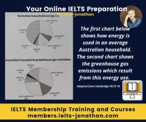
For example, let’s look at the attached visual
Looking at the graph, we can observe that
The graph type = The two pie charts
shows/compares = compare
unit of measurement and subject = how energy is used – emissions from energy use
categories = of six categories– –
place = in Australia
time = no time date is given
The two pie charts compare how energy is used and the emissions from energy use over six categories in Australia
Introductions For Single images
If your question is a single visual, the most important thing to do in your introduction is to state what it shows and pay attention to the subject and verb agreement.
You can obtain this information from the legend on the pictorial and from the question itself.
Here is an example question from IELTS.
The graph presents the energy consumption by a typical British household.
An example sentence that you could rewrite and use for your introduction could be:
The chart shows how energy is used in an average household in the United Kingdom…
Introductions for more than one image
When the question features two graphs, for example, then you should write one sentence but write about each pictorial separately and state what each shows.
Pay attention again to the subject and verb agreement
As before, this is obtainable from the legend on the pictorial and from the question itself.
Here is an example question from IELTS.
The first graph presents the energy consumption by a typical British household. The second graph presents how much consumption is generated for renewable energy.
This is the example sentence rewritten:
The first bar chart illustrates how energy is used in an average United Kingdom household…, and the second chart shows how much of that energy comes from renewable energy sources….
or
The charts illustrates how energy is used in an average United Kingdom household and how much of that energy comes from renewable energy sources….
How to write the introduction
As you can see, writing an introduction sentence for Task 1 can be relatively simple.
You will need to practice this to get better so I have provided the steps for you to follow.
Remember, you will also need to practice writing for different topics and get used to reading the questions carefully even if you follow my advice.
For a Single Graph
Use this rule:
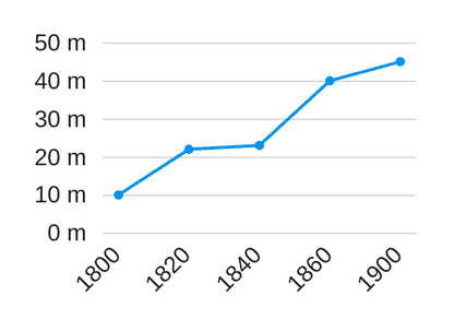
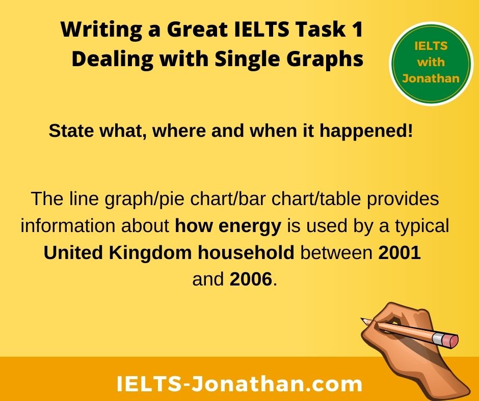
The line graph/pie chart/bar chart/table provides information about … (state what happened, where it happened and or when it happened)
Step One – State what happened
The line graph/pie chart/bar chart/table provides information about how energy is used
Step Two – State where it happened
The line graph/pie chart/bar chart/table provides information about how energy is used by a typical British household
Step Three – State when it happened
The line graph/pie chart/bar chart/table provides information about how energy is used by a typical United Kingdom household between 2001 and 2006.
For Double Graphs
Use the same rules, but apply these to both graphs.
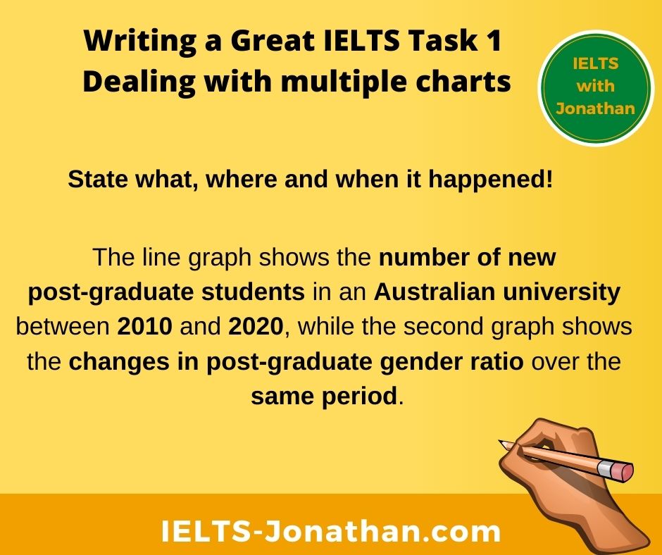
The line graph/bar chart/pie chart/table provides information about …(state what happened ,where it happened and or when it happened) while the pie chart/table/bar chart/line graph indicates (state what happened ,where it happened and or when it happened)
The line graph shows the number of new post-graduate students in an Australian university between 2010 and 2020 while the second graph shows the changes in post-graduate gender ratio over the same period.
IELTS Paraphrasing an Introduction
Never just copy the title and use this for you introduction.
If you do this, the examiner will just ignore the introduction.
Use the information IELTS gives you, but put it into your own words.
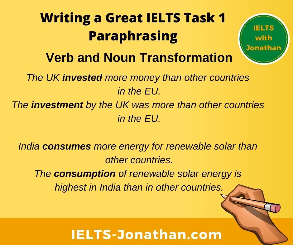
One way you can paraphrase is by changing verbs into nouns and nouns into verbs.
Although these examples are from the body of an essay, they illustrate the principles of paraphrasing.
The UK invested more money than other countries in the EU.
The investment by the UK was more than other countries in the EU.
India consumes more energy for renewable solar than other countries.
The consumption of renewable solar energy is highest in India than in other countries.
and this is from an introduction
The tables show the total investment into to renewable energies of five countries between 2010 and 2020.
The information shows how much 5 countries invested in green energy production over one decade.
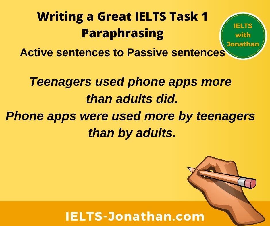
Turn Active sentence into Passive sentences
Teenagers used phone apps more than adults did.
Phone apps were used more by teenagers than by adults.
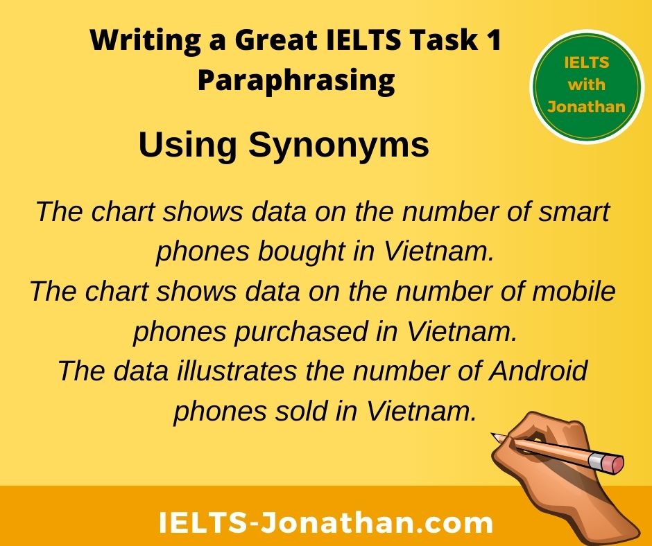
Use Synonyms and Antonyms
The chart shows data on the number of smart phones bought in Vietnam.
The chart shows data on the number of mobile phones purchased in Vietnam.
The data illustrates the number of Android phones sold in Vietnam.
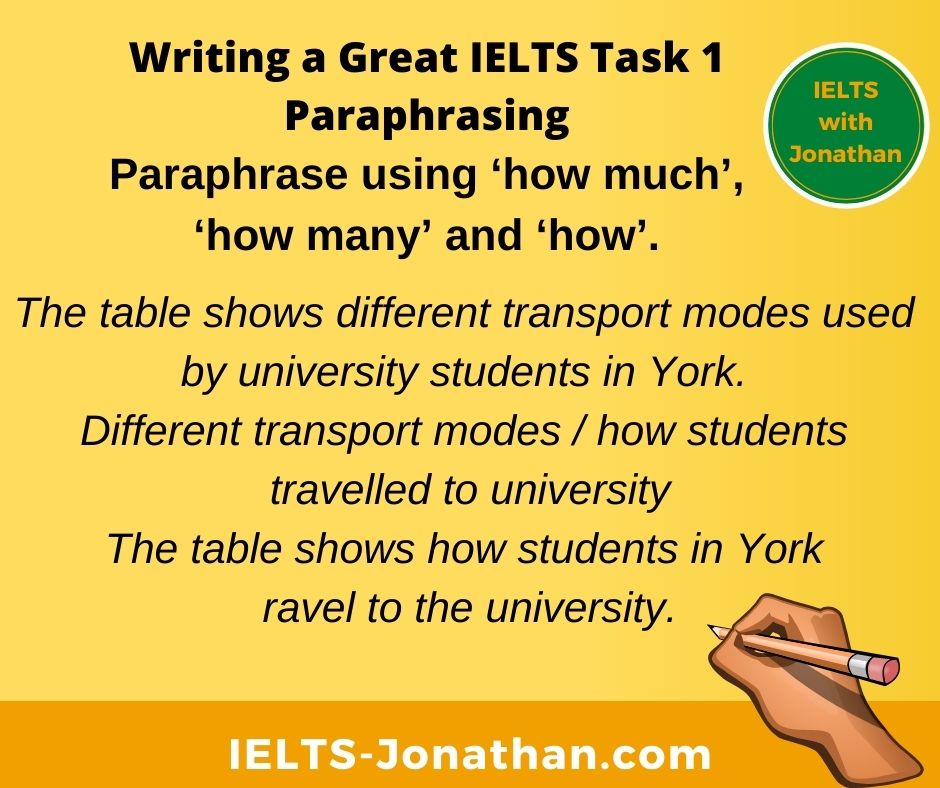
Another way to paraphrase is to use phrases like ‘how much’, ‘how many’ and ‘how’.
Look at these examples and compare.
- The pie chart shows the amount of money students’ spent on living expenses. The amount of money / how much money
The pie chart shows how much money was spent on living expenses by students
- The line graph shows the number of people who emigrated to New Zealand during the last year. The number of people / how many people
The line graph shows how many people emigrated to New Zealand last year.
- The table shows different transport modes used by university students in York. Different transport modes / how students travelled to university
The table shows how students in York travel to the university.
Reporting verbs in IELTS
It is important to have a good range of reporting verbs so you are able to paraphrase the verbs used in the question.
This makes the examiner aware you simply have not copied the topic question.
Look at the examples below and the notice the change of verb has been paraphrased.
Question:
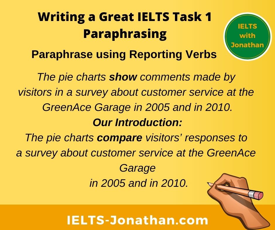
The pie charts show comments made by visitors in a survey about customer service at the GreenAce Garage in 2005 and in 2010.
Our Introduction:
The pie charts compare visitors’ responses to a survey about customer service at the GreenAce Garage in 2005 and in 2010.
The line graph below shows changes in the amount and type of fast food consumed by British teenagers from 2005 to 2015.
Our introduction:
The chart illustrates changes in the amount and type of fast food consumption by British teenagers between 2005 to 2015.
The graph shows the use of high-speed broadband internet in Korea from 1980 to 2010.
Our Introduction:
The graph compares the consumption of high-speed broadband internet in Korea in the period 1980 to 2010.
The graph shows how the internet is distributed between users of different income levels in China between 2003 to 2006.
Our Introduction:
The bar graph provides information about the distribution of internet users according to income level in China over three consecutive years.
The diagram below shows the average hours of unpaid work per week done by women.
Our Introduction:
The table illustrates how much unpaid work is done by women on average each week.
Set Phrases to Paraphrase
Finally, just look at how simply you can paraphrase by replacing keywords.
You can see how using synonyms helps you paraphrase the introduction.
I recommend that you use a vocabulary journal to note any new words you learn and try paraphrasing when you are practicing IELTS WRITING TASK 1.
A graph can be a line chart, a bar chart or chart.
A chart can be line graph, a bar graph or a bar graph.
A diagram can be a figure and a figure can be a diagram.
Shows can be illustrates if there is a comparison.
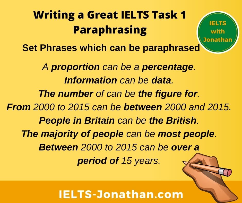
A proportion can be a percentage.
Information can be data.
The number of can be the figure for.
The proportion of can be the figure for.
People in Britain can be the British.
The majority of people can be most people.
From 2000 to 2015 can be between 2000 and 2015.
Between 2000 to 2015 can be over a period of 15 years.
How to deliver can be the process of delivery.
In three countries can be in the UK, Germany and France.
Test yourself
How many synonyms can you think of for these three words?
Don’t use a dictionary and remember a synonym is not the exact meaning, but a similar one.
Buy
Synonyms (informal):
Synonyms (formal):
Global warming
Synonyms:
Travel
Synonyms:
Some suggestions;
Buy
Synonyms (informal): To get, To grab st quickly, to get a good deal, to get a good bargain, to pick st up.
Synonyms (formal): Purchase, acquire, consume (consume and consumption are useful to describe larger economic trends for Writing Task 1)
Global warming
Synonyms: Environmental issues, harmful pollution, greenhouse effect, the warming of the planet.
Travel
Synonyms: Explore, go on an adventure, take an adventure, go on an excursion, get away, take a break, take along break, take a short break.
How was this post? I hope you found it useful.
Comment below if you have any questions.
Remember.
In Task 1, candidates are asked to describe some visual information a graph, table, chart or diagram. You need to write 150 words in about 20 minutes and you must not copy the question for your introduction.
I’m Jonathan
I’ve taught IELTS and University English in more than a dozen universities and schools around the world.
I’m a parent, traveller and passionate about language teaching and helping students achieve their dreams.
Whilst living in Austria or working in Asia, I run IELTS courses to help students get to where they want to be.
If you are serious about IELTS, connect with me to see how I can help you.




Thanks it was very helpful to me